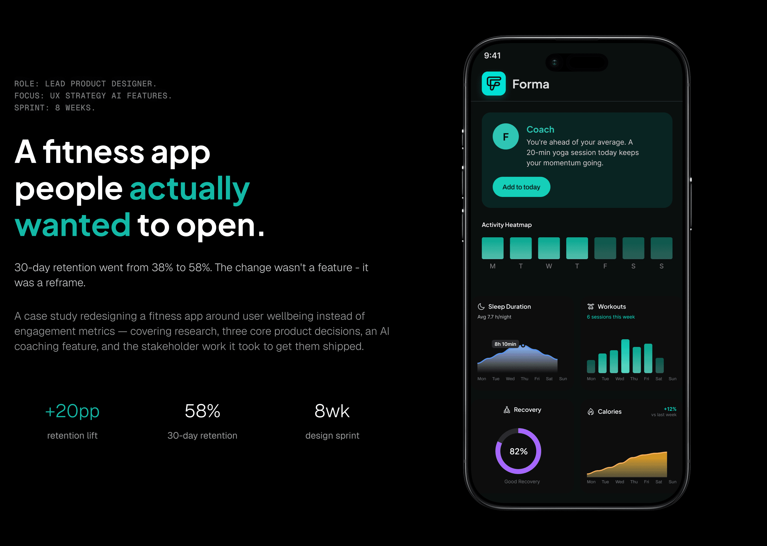
A fitness app people actually wanted to open. 30-day retention went from 38% to 58%. The change wasn't a feature - it was a reframe.
YEAR
2025
ROLE
Product Designer, leading UX research and design strategy
SERVICES
User research, experience design, interface design, A/B testing, design iteration
About the project
A case study redesigning a fitness app around user wellbeing instead of engagement metrics - covering research, three core product decisions, an AI coaching feature, and the stakeholder work it took to get them shipped.
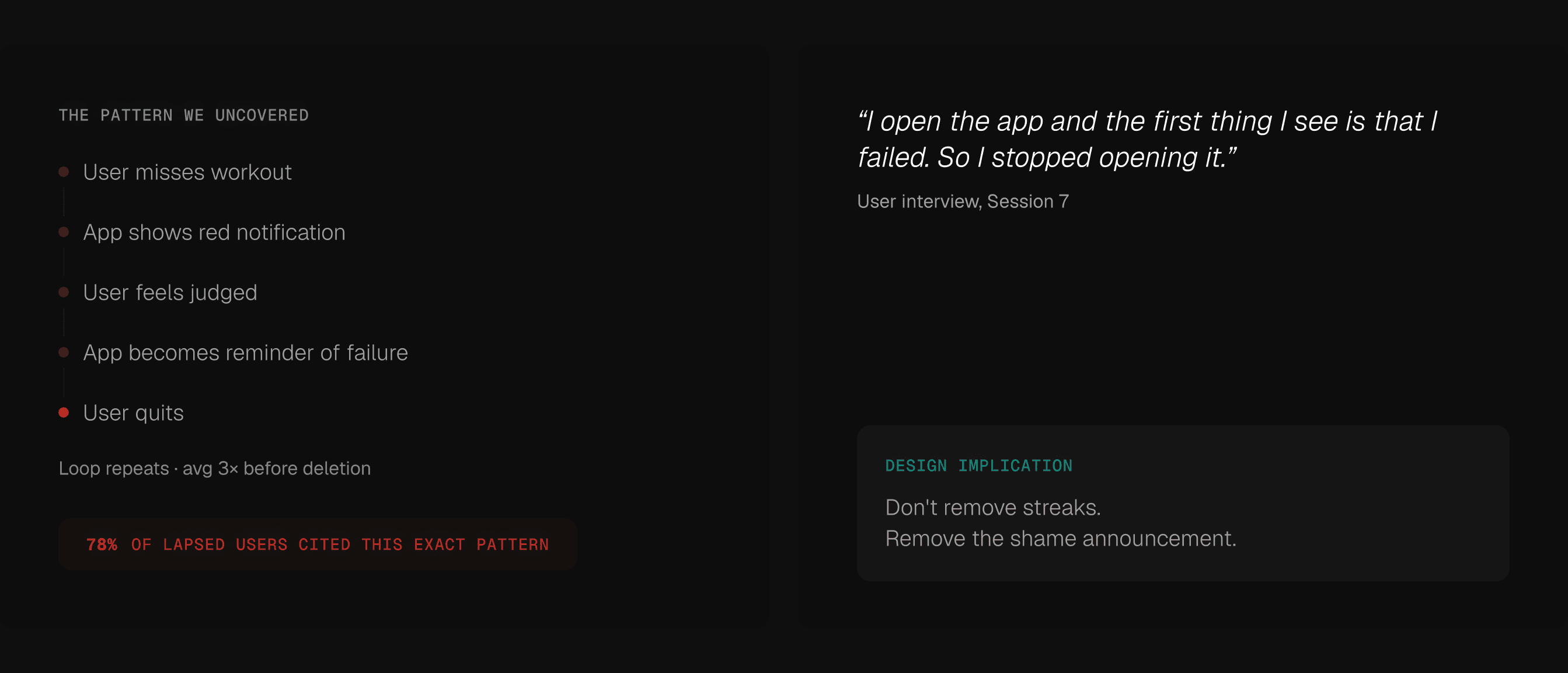
Two things the app got wrong from the start.
It measured the wrong things and asked too many questions. Both problems came from the same place - it was built around compliance, not around real people.
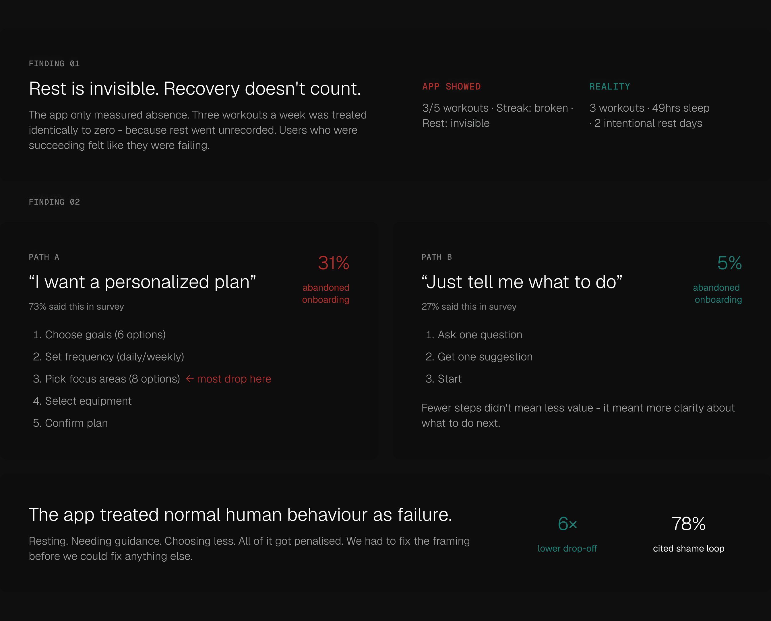
Reframe rest as data.
The dashboard wasn't too busy. It was too negative. Every number on screen was telling users they weren't doing enough.
Choose retention over engagement.
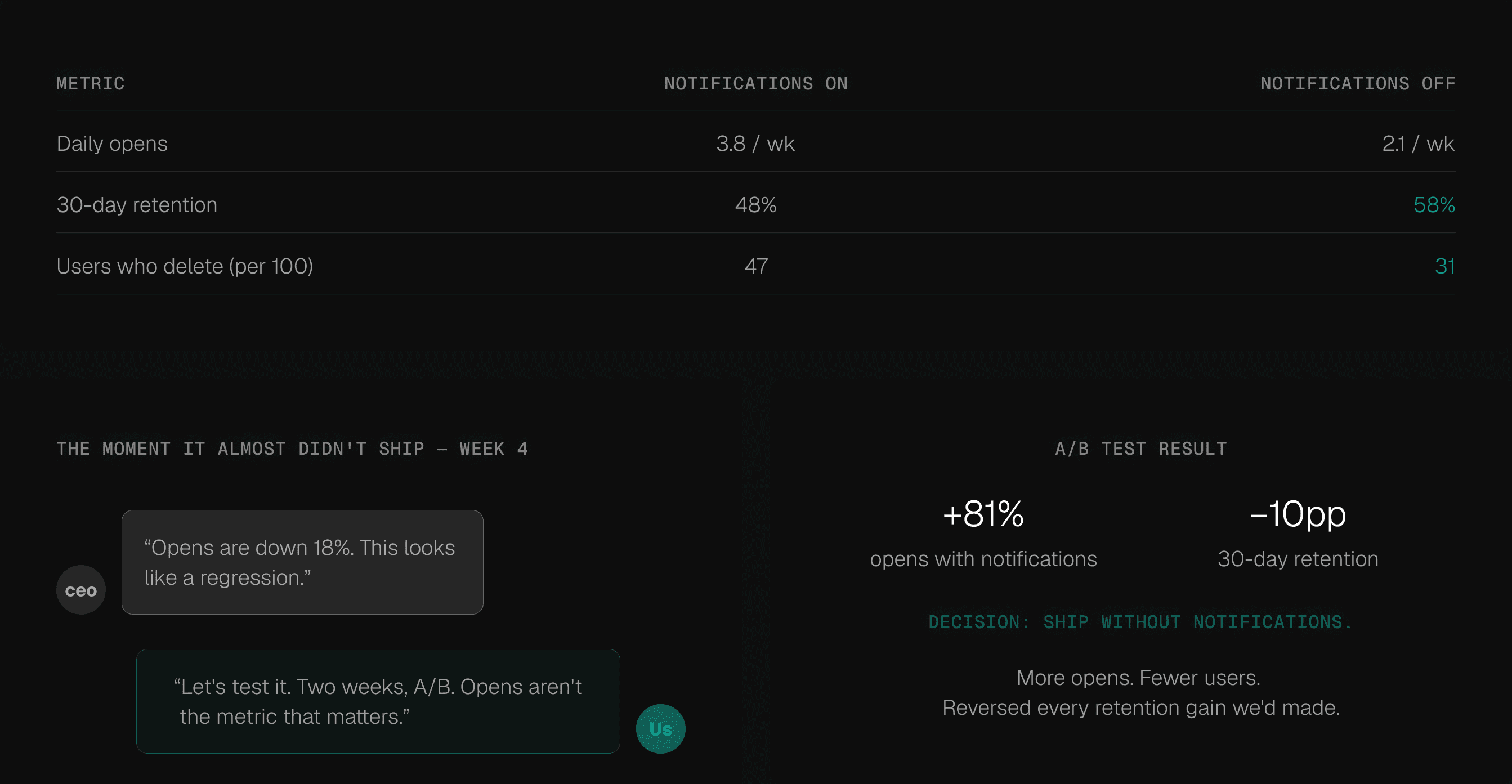
Opens are a vanity metric. We had data showing the thing driving opens was killing retention. That's a hard sell when a CEO is watching daily actives drop.
The Coach doesn't motivate. It decides.
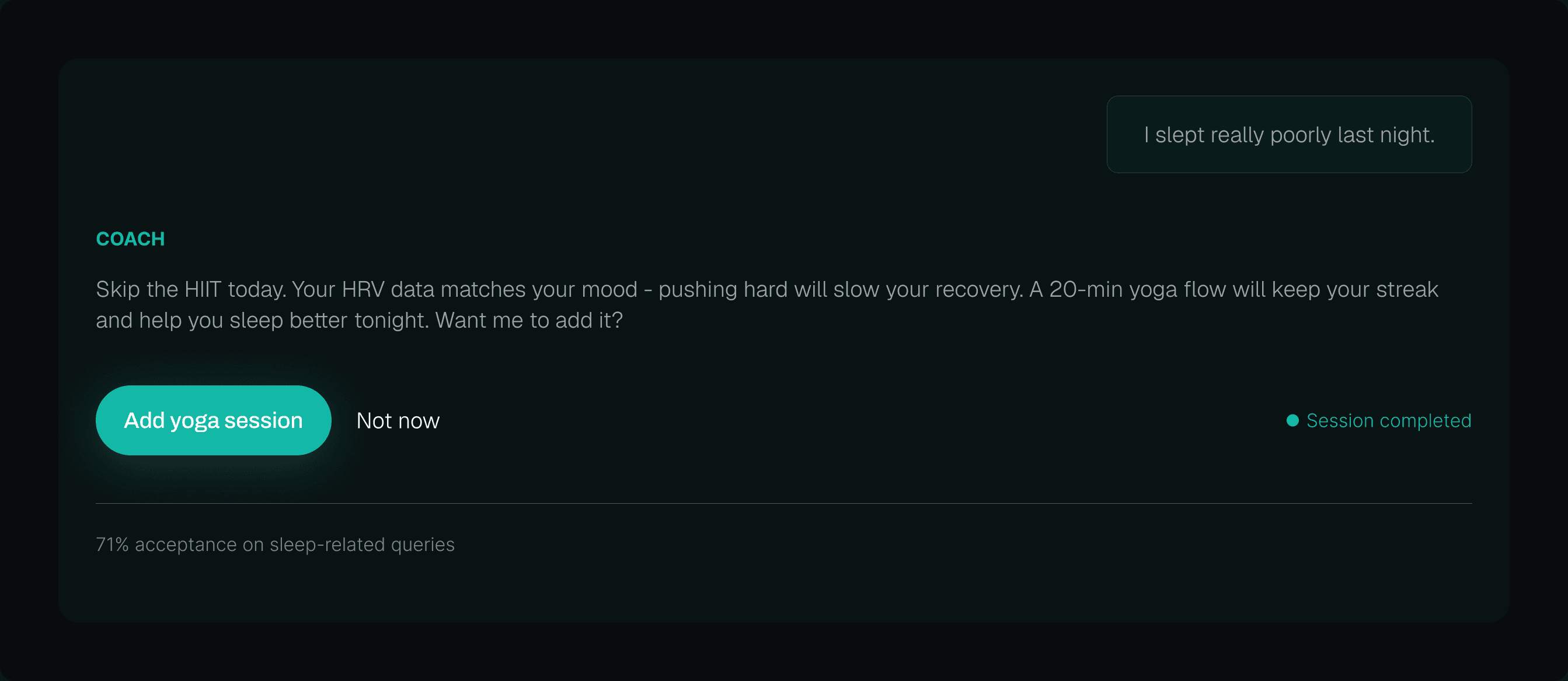
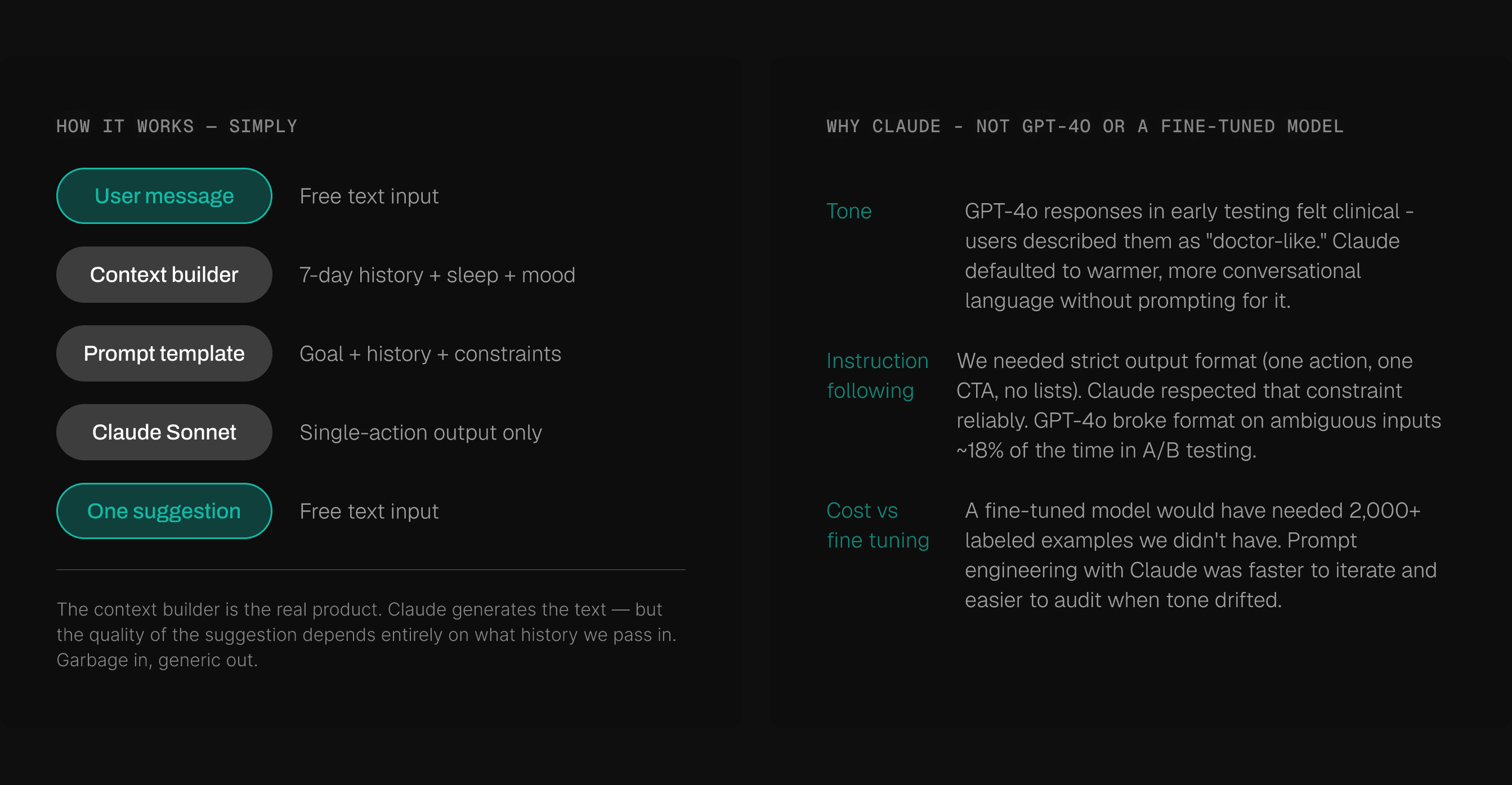
People didn't need encouragement. They needed someone to just tell them what to do today. So that's what we built.
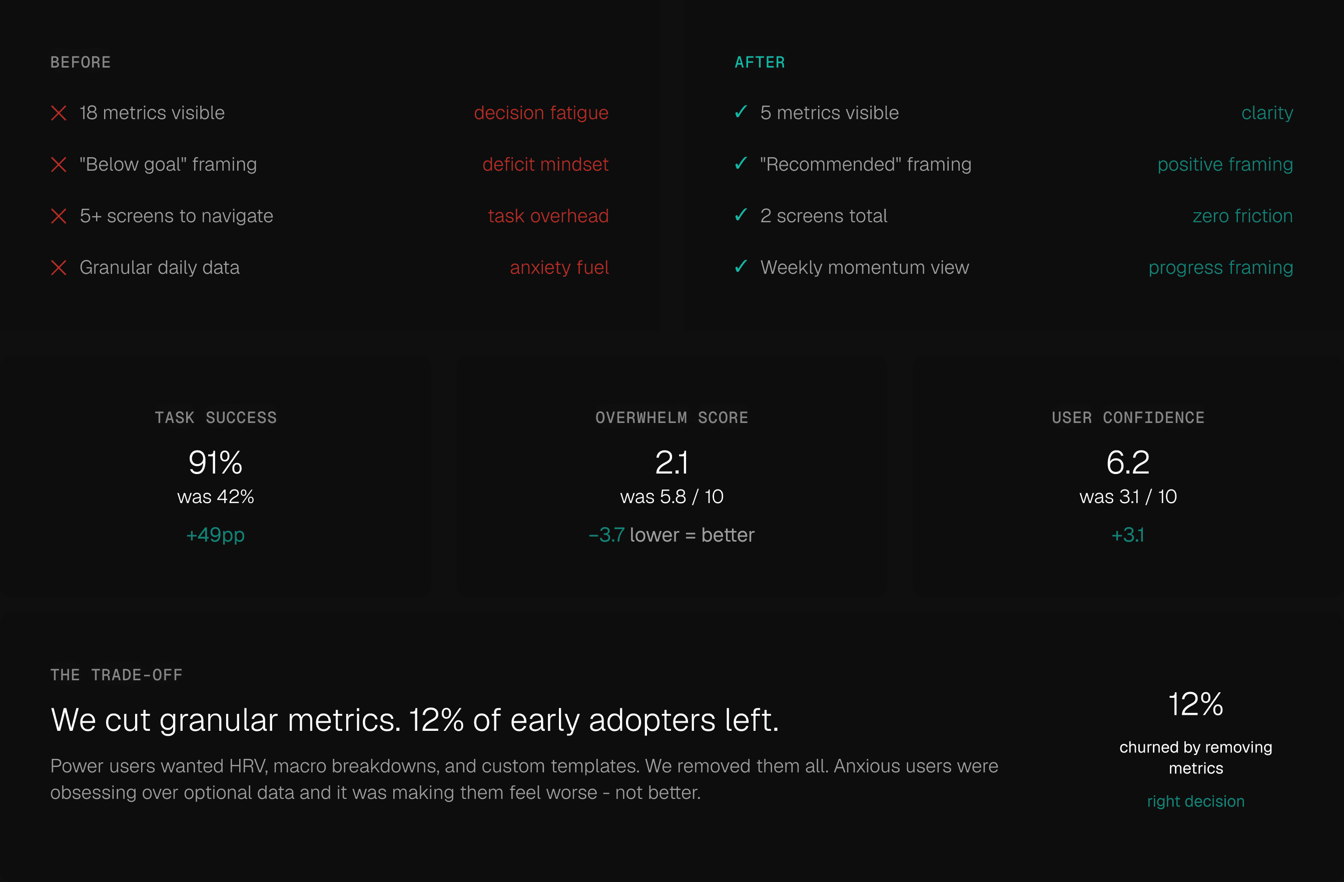
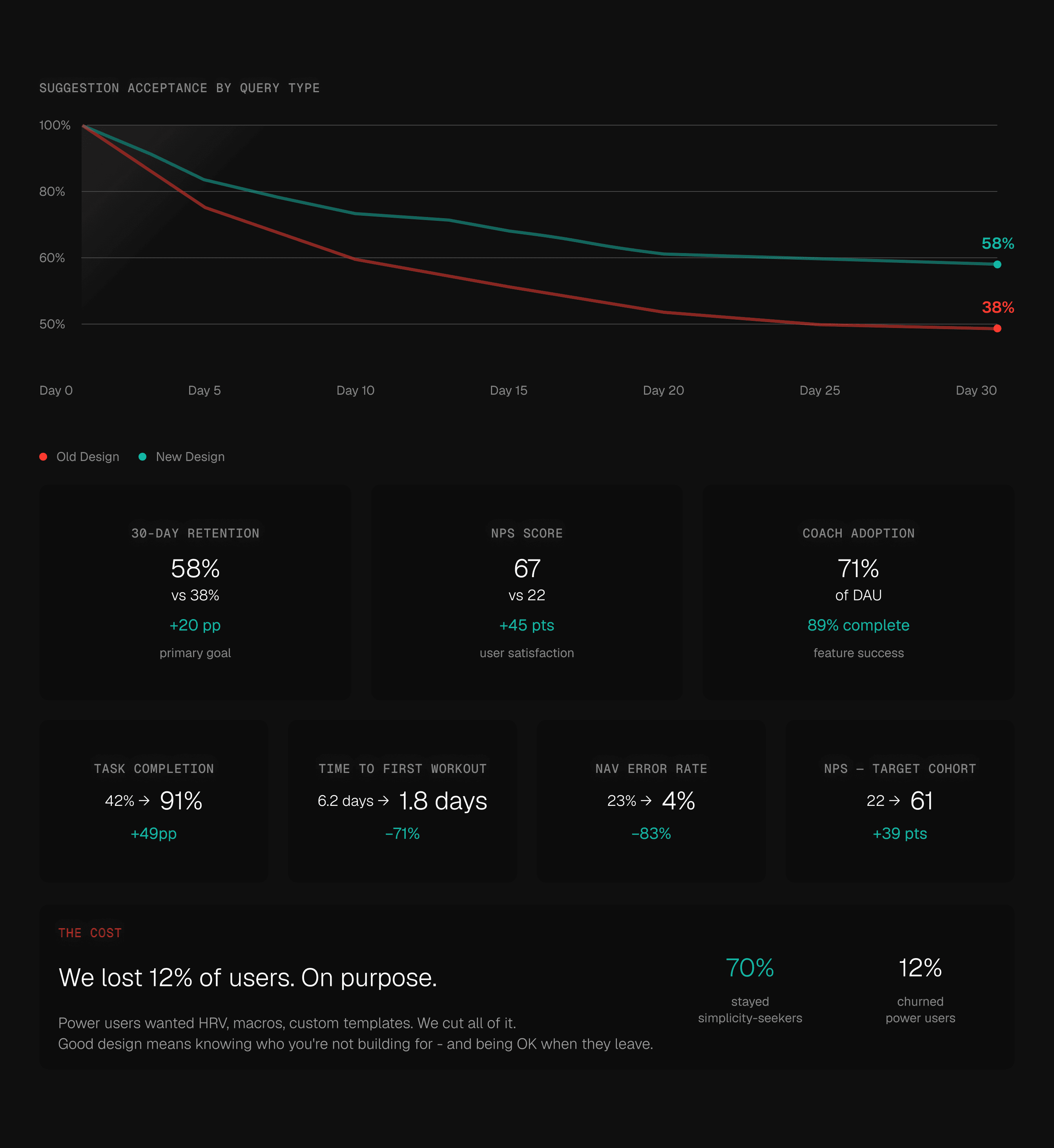
The numbers held.
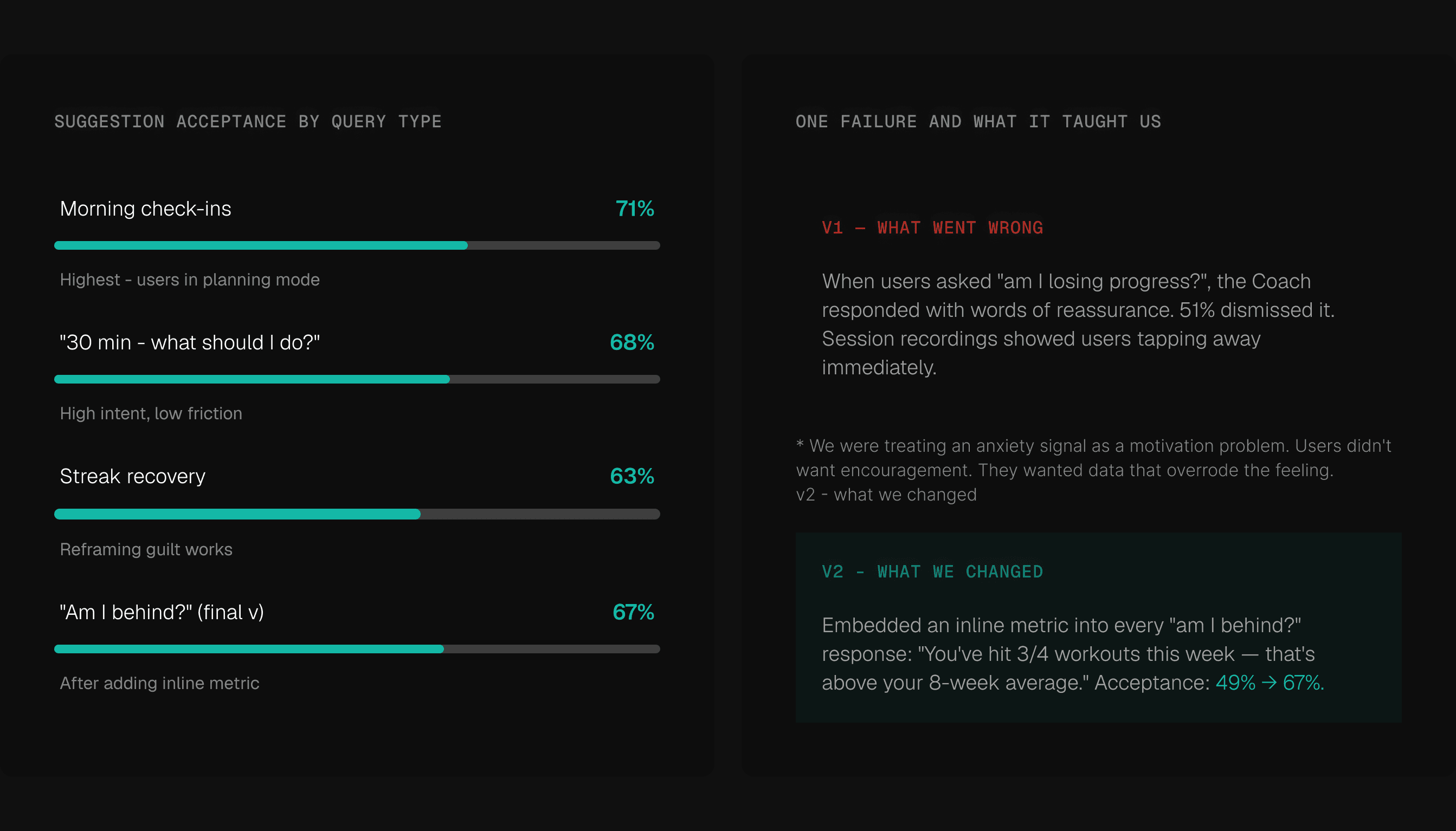
The research said it would work. The data agreed. We didn't just make the app feel better - we moved metrics that actually matter.
Making the hard call.
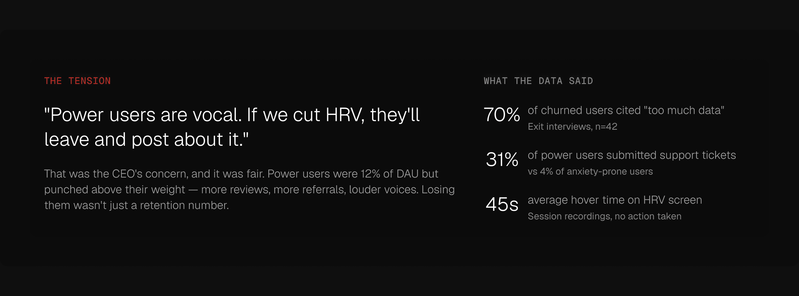
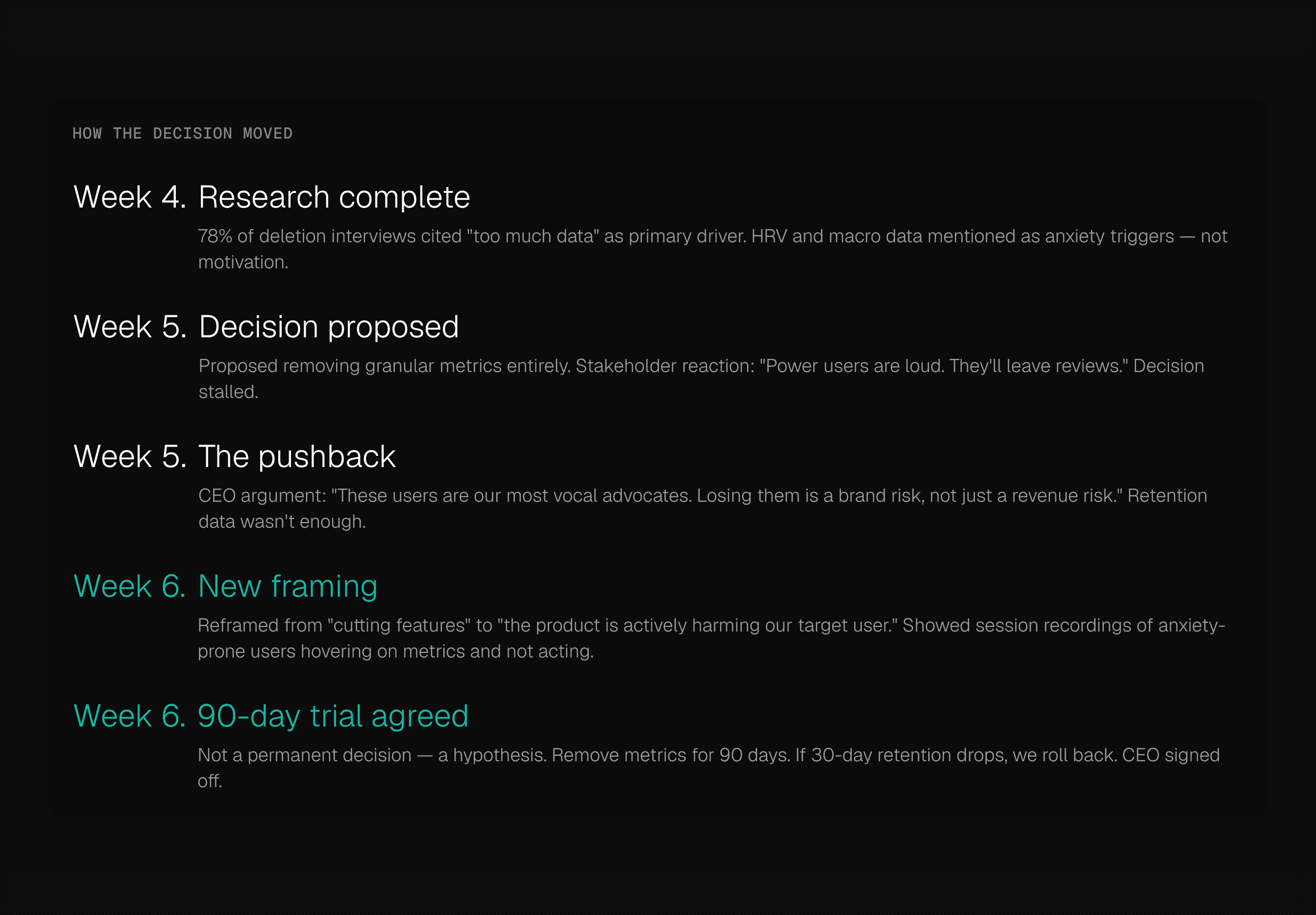
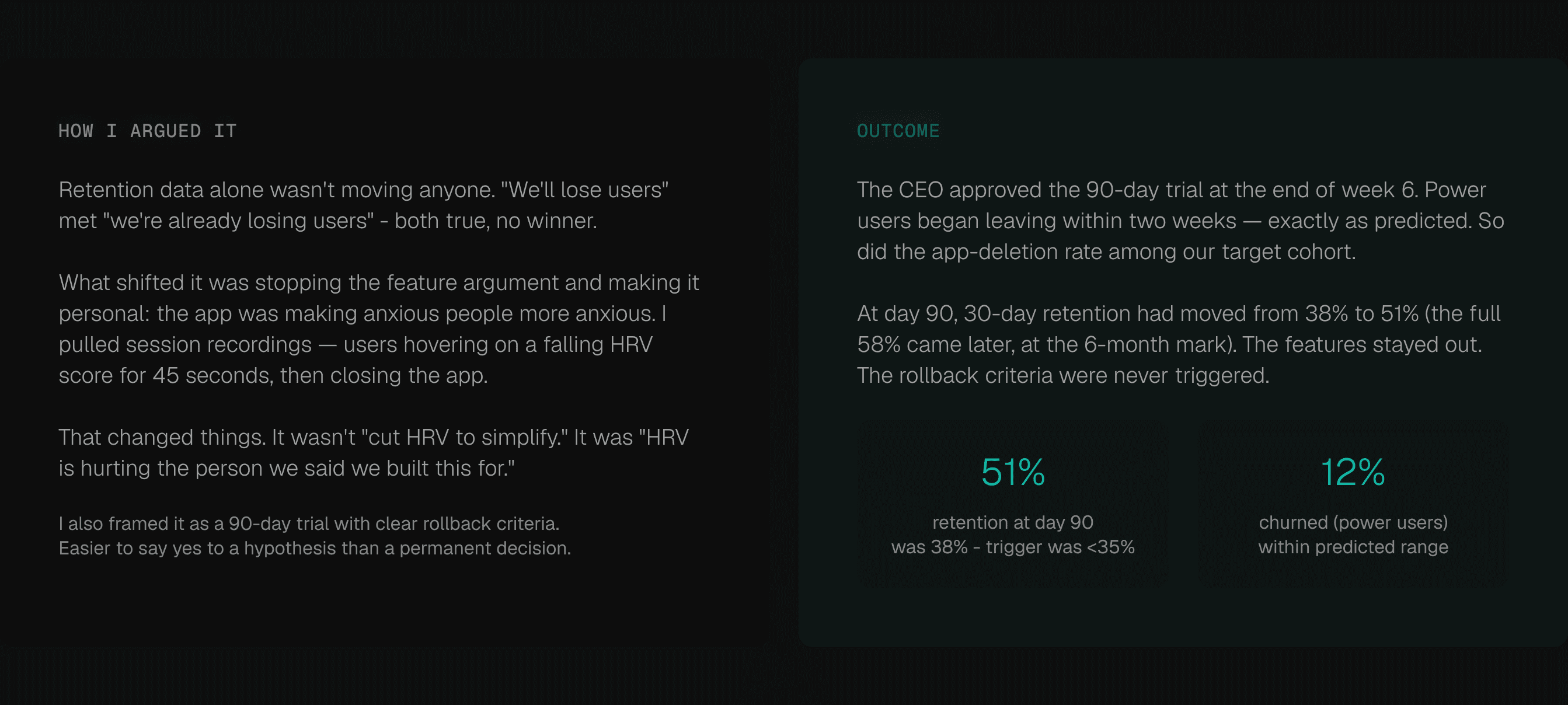
Cutting features is easy on a whiteboard. Getting sign-off is something else. The data was clear. The politics weren't.
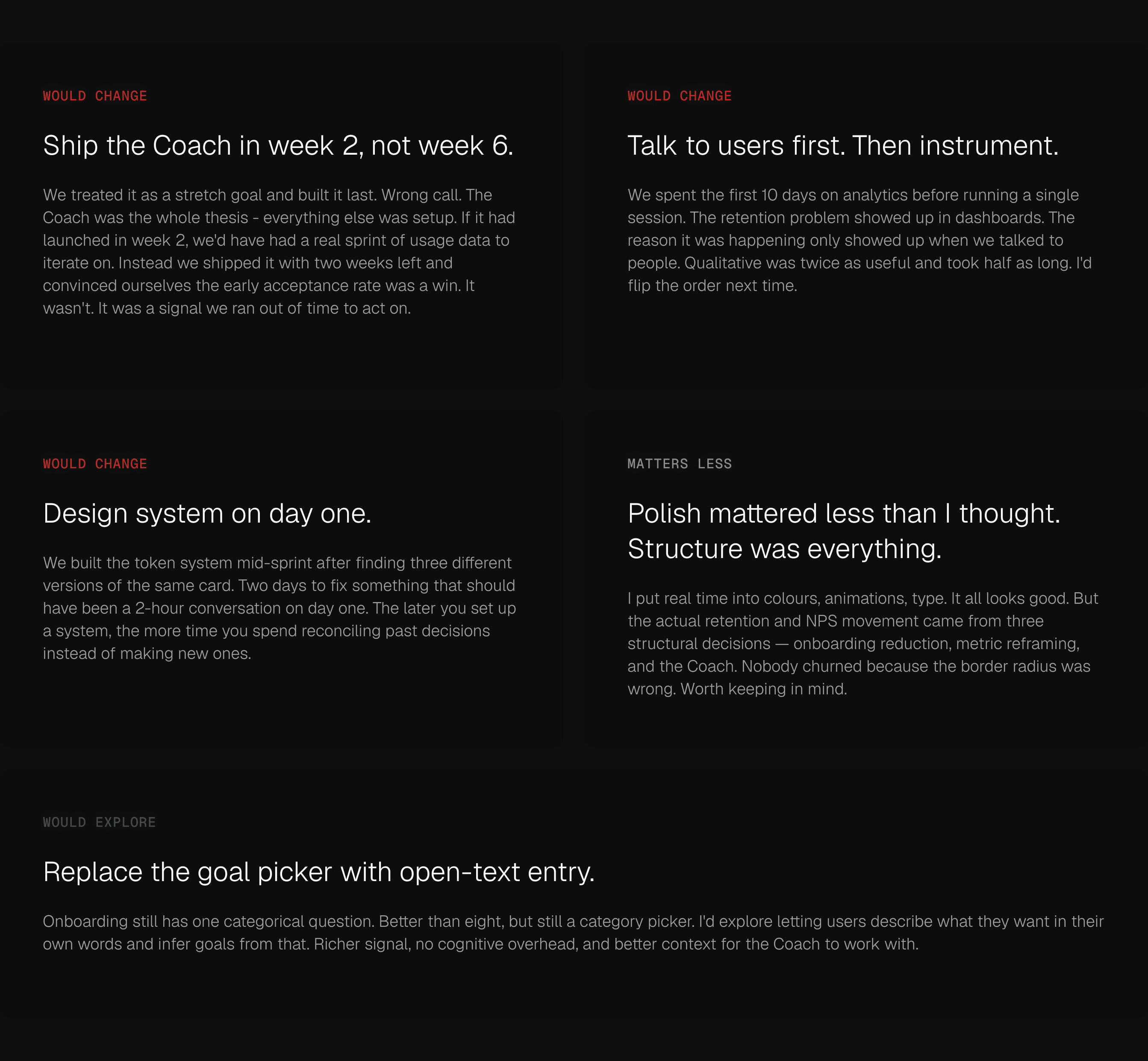
What I'd do differently.
The work is done. The metrics are good. Here's what I'd change anyway.
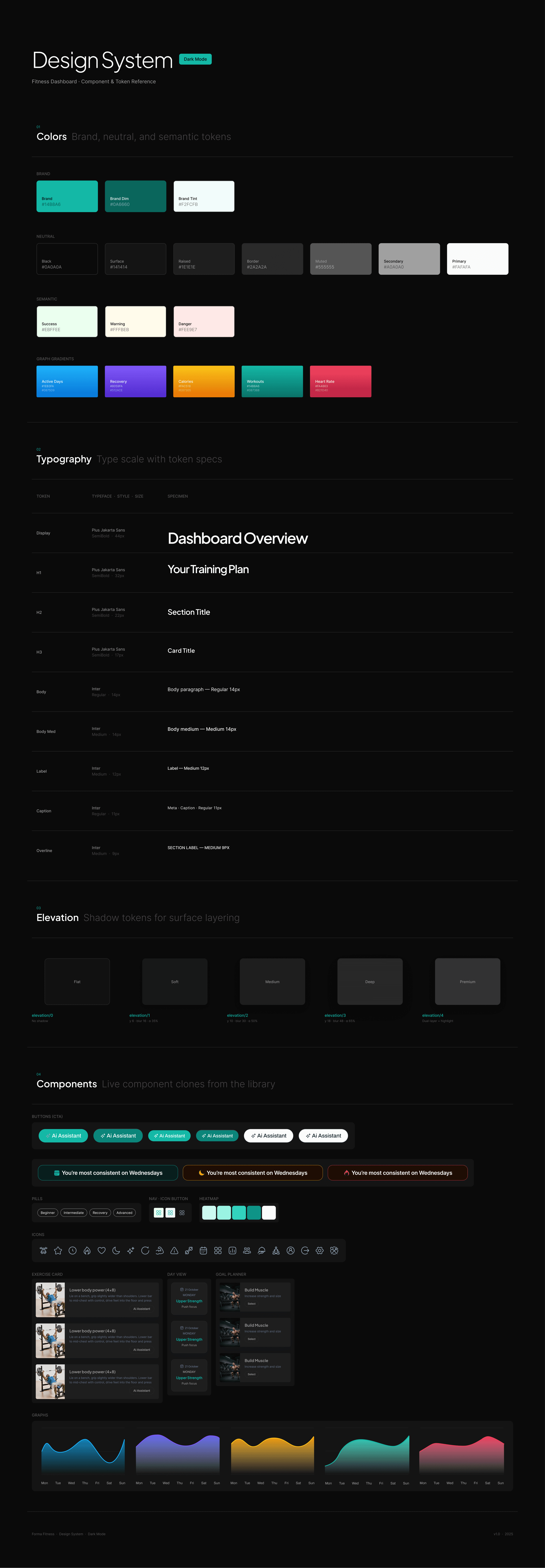
Scaling quality through design systems
A shared visual language that keeps every component, colour, and interaction aligned — from first prototype to final release. Built dark, built consistent, built to move fast without breaking things
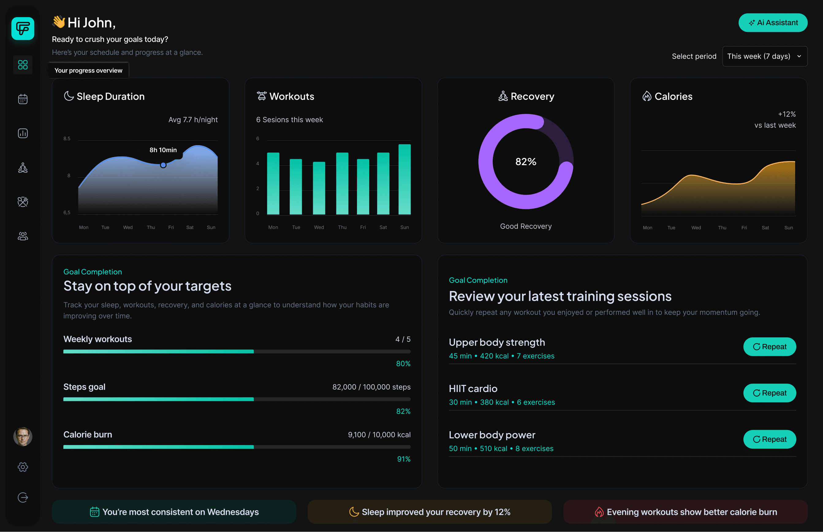
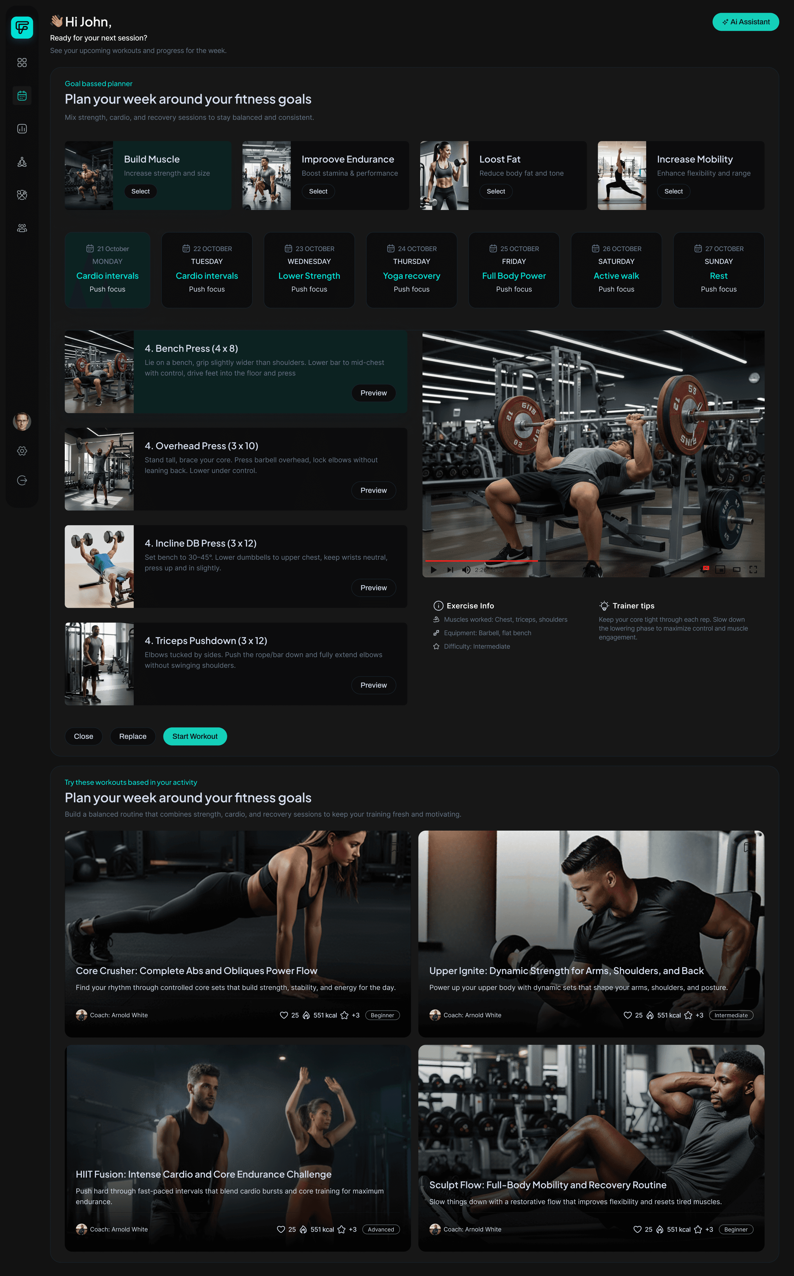
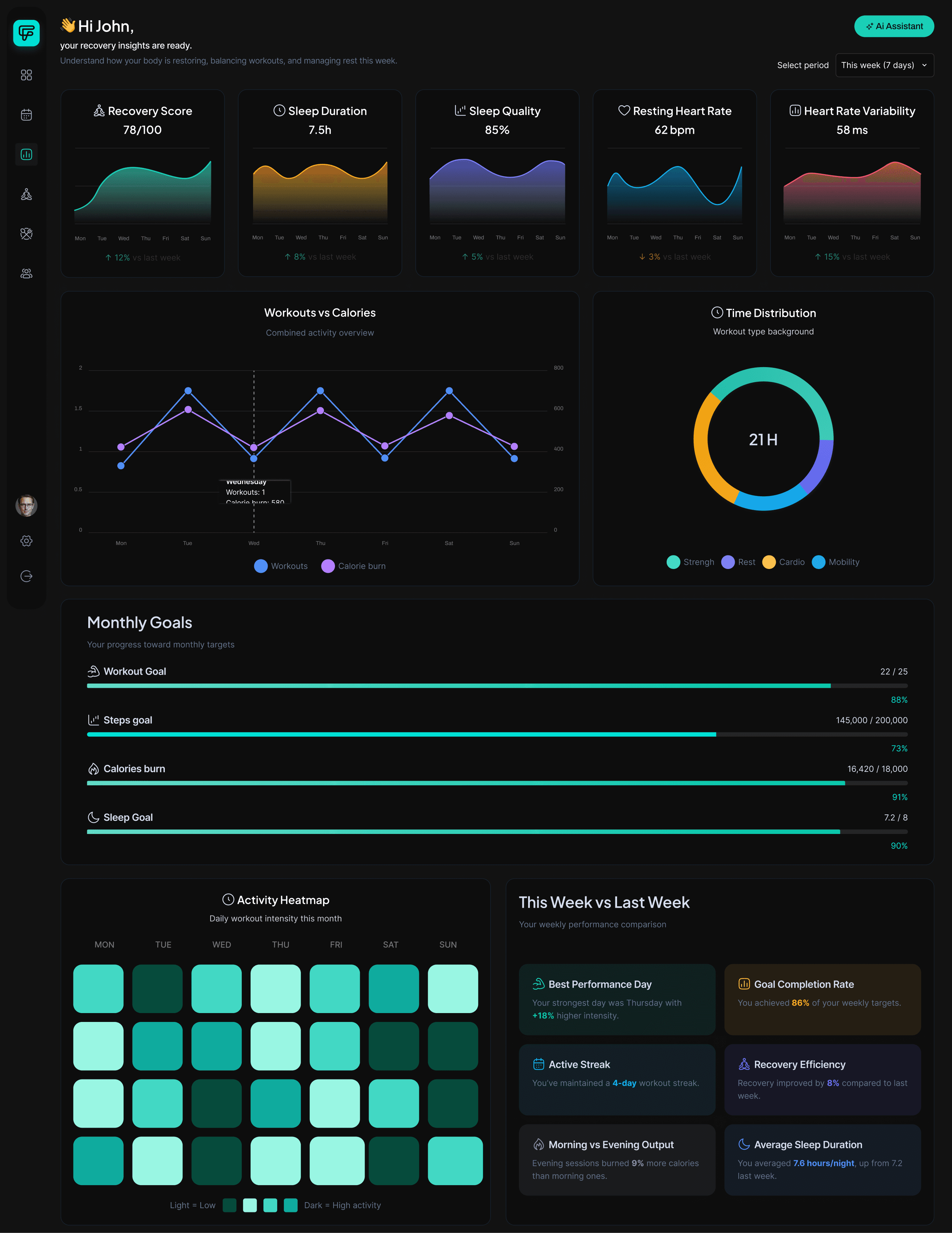
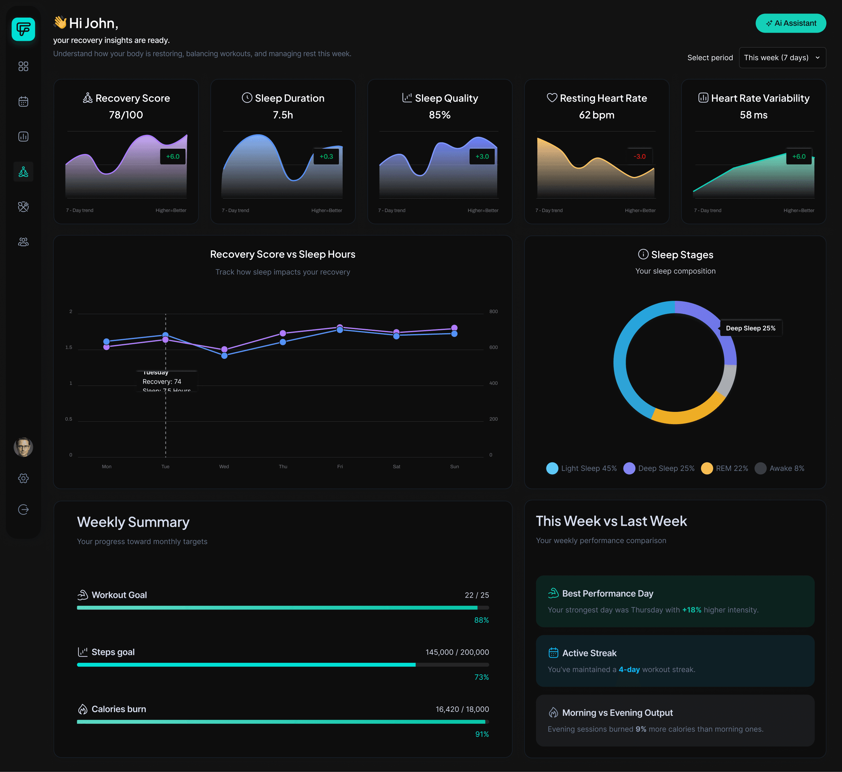
A premium interface that celebrates every step.
Dark calm aesthetic. Guided steps for real-life routines. Simple progress tracking that reduces anxiety. No guilt, no shame — just support.
Smooth Scroll
This will hide itself!
This will hide itself!
Forma fitness app redesign
OVERVIEW
A fitness app people actually wanted to open. 30-day retention went from 38% to 58%. The change wasn't a feature - it was a reframe.
YEAR
2025
ROLE
Product Designer, leading UX research and design strategy
SERVICES
User research, experience design, interface design, A/B testing, design iteration
About the project
A case study redesigning a fitness app around user wellbeing instead of engagement metrics - covering research, three core product decisions, an AI coaching feature, and the stakeholder work it took to get them shipped.
Two things the app got wrong from the start.
It measured the wrong things and asked too many questions. Both problems came from the same place - it was built around compliance, not around real people.
Reframe rest as data.
The dashboard wasn't too busy. It was too negative. Every number on screen was telling users they weren't doing enough.
Choose retention over engagement.
Opens are a vanity metric. We had data showing the thing driving opens was killing retention. That's a hard sell when a CEO is watching daily actives drop.
The Coach doesn't motivate. It decides.
People didn't need encouragement. They needed someone to just tell them what to do today. So that's what we built.
The numbers held.
The research said it would work. The data agreed. We didn't just make the app feel better - we moved metrics that actually matter.
Making the hard call.
Cutting features is easy on a whiteboard. Getting sign-off is something else. The data was clear. The politics weren't.
What I'd do differently.
The work is done. The metrics are good. Here's what I'd change anyway.
Scaling quality through design systems
A shared visual language that keeps every component, colour, and interaction aligned — from first prototype to final release. Built dark, built consistent, built to move fast without breaking things
A premium interface that celebrates every step.
Dark calm aesthetic. Guided steps for real-life routines. Simple progress tracking that reduces anxiety. No guilt, no shame — just support.
Smooth Scroll
This will hide itself!
This will hide itself!
Forma fitness app redesign
OVERVIEW
A fitness app people actually wanted to open. 30-day retention went from 38% to 58%. The change wasn't a feature - it was a reframe.
YEAR
2025
ROLE
Product Designer, leading UX research and design strategy
SERVICES
User research, experience design, interface design, A/B testing, design iteration
About the project
A case study redesigning a fitness app around user wellbeing instead of engagement metrics - covering research, three core product decisions, an AI coaching feature, and the stakeholder work it took to get them shipped.
Two things the app got wrong from the start.
It measured the wrong things and asked too many questions. Both problems came from the same place - it was built around compliance, not around real people.
Reframe rest as data.
The dashboard wasn't too busy. It was too negative. Every number on screen was telling users they weren't doing enough.
Choose retention over engagement.
Opens are a vanity metric. We had data showing the thing driving opens was killing retention. That's a hard sell when a CEO is watching daily actives drop.
The Coach doesn't motivate. It decides.
People didn't need encouragement. They needed someone to just tell them what to do today. So that's what we built.
The numbers held.
The research said it would work. The data agreed. We didn't just make the app feel better - we moved metrics that actually matter.
Making the hard call.
Cutting features is easy on a whiteboard. Getting sign-off is something else. The data was clear. The politics weren't.
What I'd do differently.
The work is done. The metrics are good. Here's what I'd change anyway.
Scaling quality through design systems
A shared visual language that keeps every component, colour, and interaction aligned — from first prototype to final release. Built dark, built consistent, built to move fast without breaking things
A premium interface that celebrates every step.
Dark calm aesthetic. Guided steps for real-life routines. Simple progress tracking that reduces anxiety. No guilt, no shame — just support.
Smooth Scroll
This will hide itself!
This will hide itself!