This is a concept project exploring a specific tension in luxury e-commerce: the gap between how brands build desire and how products are actually bought online. Most experiences separate editorial and commerce into different systems. This project tests whether they can coexist within one without weakening each other.
YEAR
2025
ROLE
UI/UX Designer,
Art Director
SERVICES
Branding,
UI/UX Design,
Art Direction,
Prototyping
About the project
Luxury works by slowing people down. E-commerce works by speeding them up. This project tests whether one system can hold both.
Context
Self-initiated concept. No client, no data.
I built this to explore a pattern I kept seeing in luxury fashion online:
brands either protect their identity and make buying harder, or optimise for conversion and lose what makes them distinct.
I wanted to test whether that trade-off is real, or just poorly handled.
The Problem
Luxury is not driven by convenience. It is driven by desire.
In a physical store, pace is intentional. You move slower. You notice more. The environment creates weight around the decision.
E-commerce removes that weight. It compresses time, reduces friction, and pushes decisions forward.
The conflict is structural:
The same choices that build desire slow users down
The same choices that increase conversion strip away meaning
Most brands resolve this by separating the two. Editorial and commerce live in different places, with different rules.
This creates a seam in the experience.
The question here was simple:
can one system carry both without feeling compromised?
Key Decisions
1. Editorial presence without hiding the path to buy
Problem
Pure editorial layouts create atmosphere but weaken navigation. Early directions felt strong visually but unclear functionally.
Options
Lean fully editorial and accept reduced discoverability
or prioritise navigation and dilute the brand tone
Decision
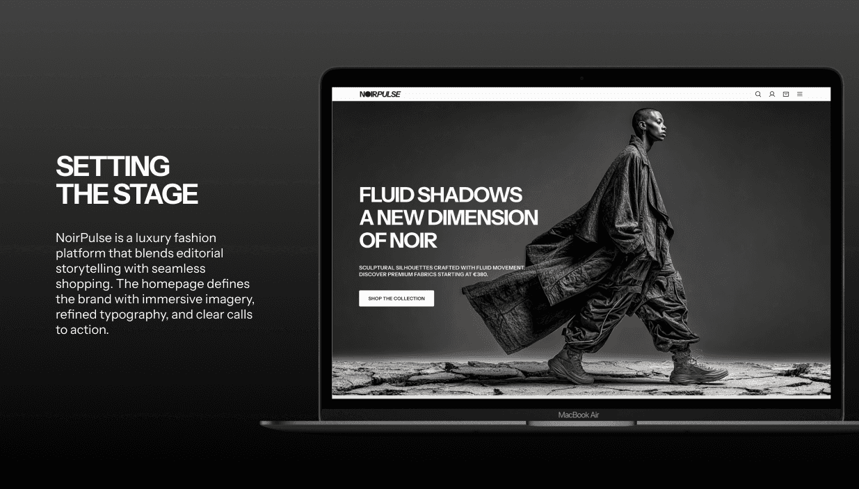
Keep the editorial scale, but make navigation and collection entry points explicit and stable
Trade-off
The result is less extreme than a pure editorial experience
but it removes ambiguity at the top of the funnel
2. Experience before information on product pages
Problem
Standard product pages optimise for speed. That logic breaks down when price and brand familiarity increase.
At that price point, users are not just evaluating a product
they are evaluating whether the brand is worth trusting
Options
Lead with price and actions for efficiency
or lead with context and risk slowing down intent-driven users
Decision
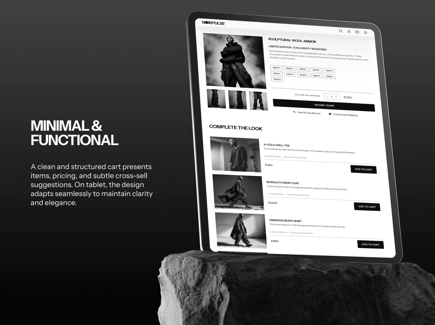
Sequence the page: editorial imagery first, product information second
Trade-off
Returning or high-intent users experience friction
but first-time buyers get the context needed to justify the purchase
3. Trust before input in checkout
Problem
At high price points, abandonment is often hesitation, not confusion
Users are not struggling with forms
they are questioning legitimacy
Options
Standard checkout flow
or introduce trust signals before asking for input
Decision
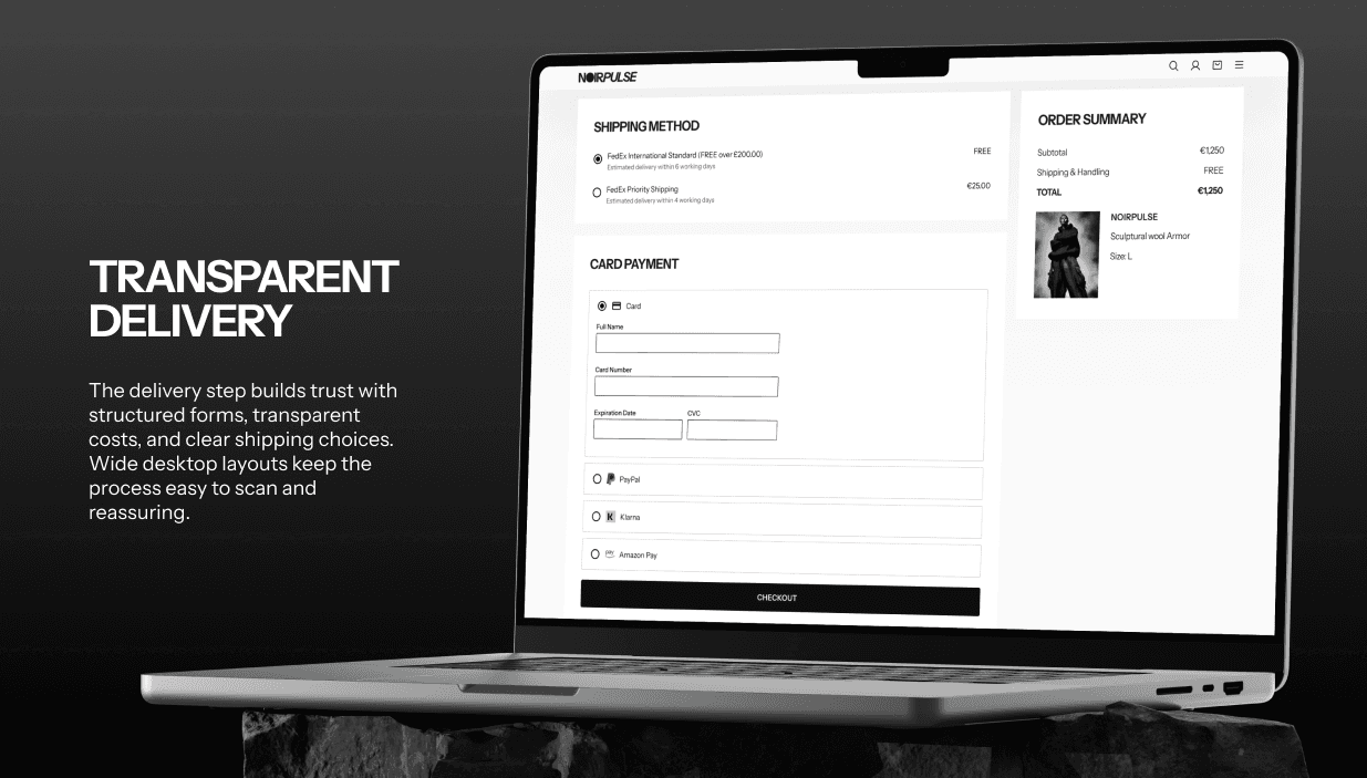
Surface PayPal, Klarna, and Amazon Pay immediately
Trade-off
Slight friction for card-first users
in exchange for stronger trust signalling at the most sensitive step
4. Designing mobile as a separate problem
Problem
Editorial systems rely on space, scale, and restraint
all of which collapse quickly on mobile
Most implementations degrade here
Options
Adapt desktop layouts down
or treat each breakpoint as its own system
Decision
Design mobile in parallel with the same constraints, not as a derivative
Trade-off
Higher design cost
but consistency in experience, not just layout
What Was Designed
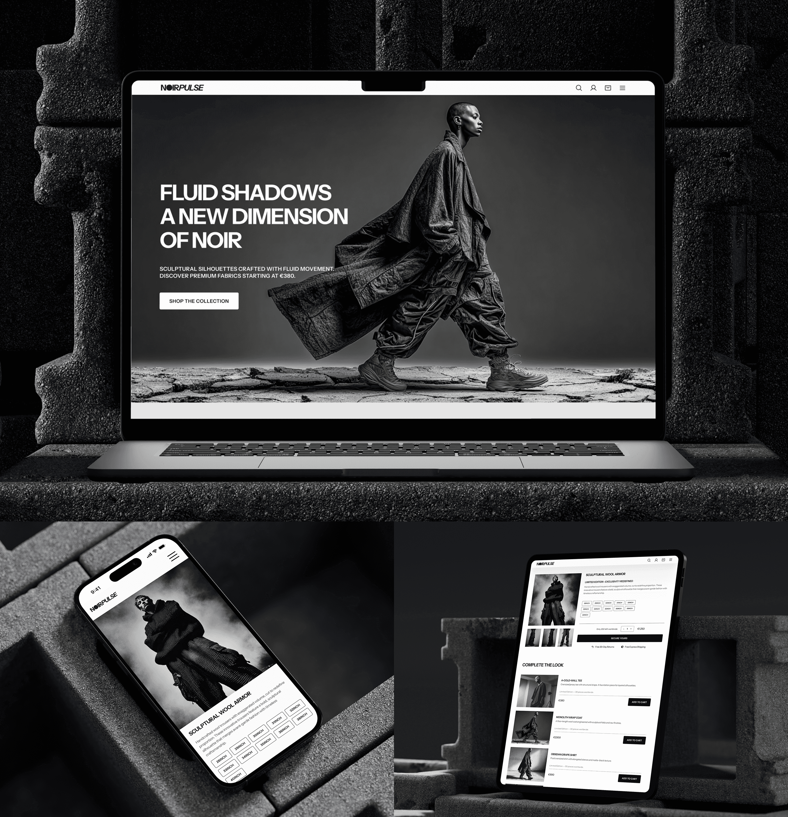
Five core screens: homepage, product page, cart, checkout, confirmation.
The homepage establishes the system and entry into collections.
The product page carries the most tension and is the critical screen.
If the story-first sequence doesn’t earn the transition into product information, the entire premise of the project breaks there.
The cart and checkout deliberately reduce brand expression in favour of clarity.
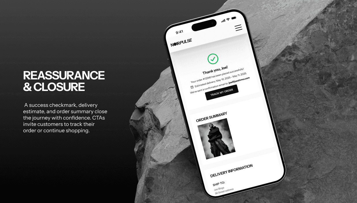
The confirmation reintroduces tone without interrupting completion.
What I’d Test
1. Story-first product pages
Does increased context change behaviour, or just add scroll?
More interesting than conversion is impact on:
average order value
return rate
2. Express-first checkout
Does surfacing trusted payment methods reduce hesitation for first-time users?
Expected impact is higher for users entering through low-intent channels like social
3. Editorial upsell (“Complete the Look”)
Does curation increase basket size?
This depends less on UI and more on whether recommendations feel intentional or automated
What This Demonstrates
This project is not about a visual style. It’s about making decisions where brand and conversion pull in different directions, clarity and atmosphere compete, speed and meaning conflict.
Each decision has a cost. I’ve called those out explicitly.
The role of a senior designer is not to remove trade-offs
it’s to choose them deliberately and understand their impact.



Smooth Scroll
This will hide itself!
This will hide itself!
Noirpulse
OVERVIEW
This is a concept project exploring a specific tension in luxury e-commerce: the gap between how brands build desire and how products are actually bought online. Most experiences separate editorial and commerce into different systems. This project tests whether they can coexist within one without weakening each other.
YEAR
2025
ROLE
UI/UX Designer,
Art Director
SERVICES
Branding,
UI/UX Design,
Art Direction,
Prototyping
About the project
Luxury works by slowing people down. E-commerce works by speeding them up. This project tests whether one system can hold both.
Context
Self-initiated concept. No client, no data.
I built this to explore a pattern I kept seeing in luxury fashion online:
brands either protect their identity and make buying harder, or optimise for conversion and lose what makes them distinct.
I wanted to test whether that trade-off is real, or just poorly handled.
The Problem
Luxury is not driven by convenience. It is driven by desire.
In a physical store, pace is intentional. You move slower. You notice more. The environment creates weight around the decision.
E-commerce removes that weight. It compresses time, reduces friction, and pushes decisions forward.
The conflict is structural:
The same choices that build desire slow users down
The same choices that increase conversion strip away meaning
Most brands resolve this by separating the two. Editorial and commerce live in different places, with different rules.
This creates a seam in the experience.
The question here was simple:
can one system carry both without feeling compromised?
Key Decisions
1. Editorial presence without hiding the path to buy
Problem
Pure editorial layouts create atmosphere but weaken navigation. Early directions felt strong visually but unclear functionally.
Options
Lean fully editorial and accept reduced discoverability
or prioritise navigation and dilute the brand tone
Decision
Keep the editorial scale, but make navigation and collection entry points explicit and stable
Trade-off
The result is less extreme than a pure editorial experience
but it removes ambiguity at the top of the funnel
2. Experience before information on product pages
Problem
Standard product pages optimise for speed. That logic breaks down when price and brand familiarity increase.
At that price point, users are not just evaluating a product
they are evaluating whether the brand is worth trusting
Options
Lead with price and actions for efficiency
or lead with context and risk slowing down intent-driven users
Decision
Sequence the page: editorial imagery first, product information second
Trade-off
Returning or high-intent users experience friction
but first-time buyers get the context needed to justify the purchase
3. Trust before input in checkout
Problem
At high price points, abandonment is often hesitation, not confusion
Users are not struggling with forms
they are questioning legitimacy
Options
Standard checkout flow
or introduce trust signals before asking for input
Decision
Surface PayPal, Klarna, and Amazon Pay immediately
Trade-off
Slight friction for card-first users
in exchange for stronger trust signalling at the most sensitive step
4. Designing mobile as a separate problem
Problem
Editorial systems rely on space, scale, and restraint
all of which collapse quickly on mobile
Most implementations degrade here
Options
Adapt desktop layouts down
or treat each breakpoint as its own system
Decision
Design mobile in parallel with the same constraints, not as a derivative
Trade-off
Higher design cost
but consistency in experience, not just layout
What Was Designed
Five core screens: homepage, product page, cart, checkout, confirmation.
The homepage establishes the system and entry into collections.
The product page carries the most tension and is the critical screen.
If the story-first sequence doesn’t earn the transition into product information, the entire premise of the project breaks there.
The cart and checkout deliberately reduce brand expression in favour of clarity.
The confirmation reintroduces tone without interrupting completion.
What I’d Test
1. Story-first product pages
Does increased context change behaviour, or just add scroll?
More interesting than conversion is impact on:
average order value
return rate
2. Express-first checkout
Does surfacing trusted payment methods reduce hesitation for first-time users?
Expected impact is higher for users entering through low-intent channels like social
3. Editorial upsell (“Complete the Look”)
Does curation increase basket size?
This depends less on UI and more on whether recommendations feel intentional or automated
What This Demonstrates
This project is not about a visual style. It’s about making decisions where brand and conversion pull in different directions, clarity and atmosphere compete, speed and meaning conflict.
Each decision has a cost. I’ve called those out explicitly.
The role of a senior designer is not to remove trade-offs
it’s to choose them deliberately and understand their impact.
Smooth Scroll
This will hide itself!
This will hide itself!
Noirpulse
OVERVIEW
This is a concept project exploring a specific tension in luxury e-commerce: the gap between how brands build desire and how products are actually bought online. Most experiences separate editorial and commerce into different systems. This project tests whether they can coexist within one without weakening each other.
YEAR
2025
ROLE
UI/UX Designer,
Art Director
SERVICES
Branding,
UI/UX Design,
Art Direction,
Prototyping
About the project
Luxury works by slowing people down. E-commerce works by speeding them up. This project tests whether one system can hold both.
Context
Self-initiated concept. No client, no data.
I built this to explore a pattern I kept seeing in luxury fashion online:
brands either protect their identity and make buying harder, or optimise for conversion and lose what makes them distinct.
I wanted to test whether that trade-off is real, or just poorly handled.
The Problem
Luxury is not driven by convenience. It is driven by desire.
In a physical store, pace is intentional. You move slower. You notice more. The environment creates weight around the decision.
E-commerce removes that weight. It compresses time, reduces friction, and pushes decisions forward.
The conflict is structural:
The same choices that build desire slow users down
The same choices that increase conversion strip away meaning
Most brands resolve this by separating the two. Editorial and commerce live in different places, with different rules.
This creates a seam in the experience.
The question here was simple:
can one system carry both without feeling compromised?
Key Decisions
1. Editorial presence without hiding the path to buy
Problem
Pure editorial layouts create atmosphere but weaken navigation. Early directions felt strong visually but unclear functionally.
Options
Lean fully editorial and accept reduced discoverability
or prioritise navigation and dilute the brand tone
Decision
Keep the editorial scale, but make navigation and collection entry points explicit and stable
Trade-off
The result is less extreme than a pure editorial experience
but it removes ambiguity at the top of the funnel
2. Experience before information on product pages
Problem
Standard product pages optimise for speed. That logic breaks down when price and brand familiarity increase.
At that price point, users are not just evaluating a product
they are evaluating whether the brand is worth trusting
Options
Lead with price and actions for efficiency
or lead with context and risk slowing down intent-driven users
Decision
Sequence the page: editorial imagery first, product information second
Trade-off
Returning or high-intent users experience friction
but first-time buyers get the context needed to justify the purchase
3. Trust before input in checkout
Problem
At high price points, abandonment is often hesitation, not confusion
Users are not struggling with forms
they are questioning legitimacy
Options
Standard checkout flow
or introduce trust signals before asking for input
Decision
Surface PayPal, Klarna, and Amazon Pay immediately
Trade-off
Slight friction for card-first users
in exchange for stronger trust signalling at the most sensitive step
4. Designing mobile as a separate problem
Problem
Editorial systems rely on space, scale, and restraint
all of which collapse quickly on mobile
Most implementations degrade here
Options
Adapt desktop layouts down
or treat each breakpoint as its own system
Decision
Design mobile in parallel with the same constraints, not as a derivative
Trade-off
Higher design cost
but consistency in experience, not just layout
What Was Designed
Five core screens: homepage, product page, cart, checkout, confirmation.
The homepage establishes the system and entry into collections.
The product page carries the most tension and is the critical screen.
If the story-first sequence doesn’t earn the transition into product information, the entire premise of the project breaks there.
The cart and checkout deliberately reduce brand expression in favour of clarity.
The confirmation reintroduces tone without interrupting completion.
What I’d Test
1. Story-first product pages
Does increased context change behaviour, or just add scroll?
More interesting than conversion is impact on:
average order value
return rate
2. Express-first checkout
Does surfacing trusted payment methods reduce hesitation for first-time users?
Expected impact is higher for users entering through low-intent channels like social
3. Editorial upsell (“Complete the Look”)
Does curation increase basket size?
This depends less on UI and more on whether recommendations feel intentional or automated
What This Demonstrates
This project is not about a visual style. It’s about making decisions where brand and conversion pull in different directions, clarity and atmosphere compete, speed and meaning conflict.
Each decision has a cost. I’ve called those out explicitly.
The role of a senior designer is not to remove trade-offs
it’s to choose them deliberately and understand their impact.
Smooth Scroll
This will hide itself!
This will hide itself!