When 82% of users prefer their own spreadsheets over the product, the interface is the problem. The THG Dashboard redesign replaced a generic layout with role-based defaults — putting the right metrics in front of the right people immediately. Discovery time dropped from 18 seconds to 2.3, and support tickets fell 85%.
YEAR
2024
ROLE
Product Design
SERVICES
Product Strategy
UX Research
Dashboard Design
Data Visualization
Design Systems
About the project
THE PROBLEM
A tool nobody trusted.
82% of users ignored the reporting platform and ran their own spreadsheets instead. Not out of habit — the tool genuinely didn't work for them. Critical metrics required two screens minimum to find, and a single generic layout served nobody's actual workflow. Analysts became a manual bottleneck. The dashboard existed; it just wasn't used.
THE DECISION THAT MATTERED
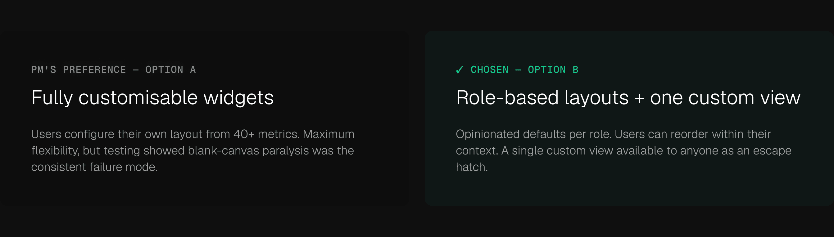
The PM wanted fully customisable layouts. I didn't think that would work.
Every user we tested with a blank canvas and 40+ metric options stalled before making a single choice. Flexibility without structure isn't empowering — it's paralysing. I proposed role-based defaults with constrained customisation instead: opinionated starting layouts per role, widget reordering, and one custom view as an escape valve for edge cases.
The PM agreed. The side effect: fewer layout variations meant a simpler component system and a build estimate that dropped from six weeks to four.
THE ARGUMENT I HAD TO MAKE
A position, not a compromise.
I pushed for role-based layouts before I had shipped data to prove it. The case was built on six moderated sessions — a small sample, but consistent enough to be directional.
The pattern across every session: users with opinionated defaults found their primary metric faster, completed tasks more confidently, and expressed less frustration. Users given a blank canvas spent more time configuring than using.
This wasn't about restricting flexibility. It was about the difference between what users say they want (control) and what actually serves them (a strong starting point). Structured defaults get people to value faster. That's the product argument — and ultimately, the PM moved on it.
What the testing showed.
Six moderated sessions with finance leads and operations heads. High-fidelity Figma prototypes. Two weeks. Six is a small sample — these were directional signals, not statistical proof. What mattered was the consistency of the pattern.
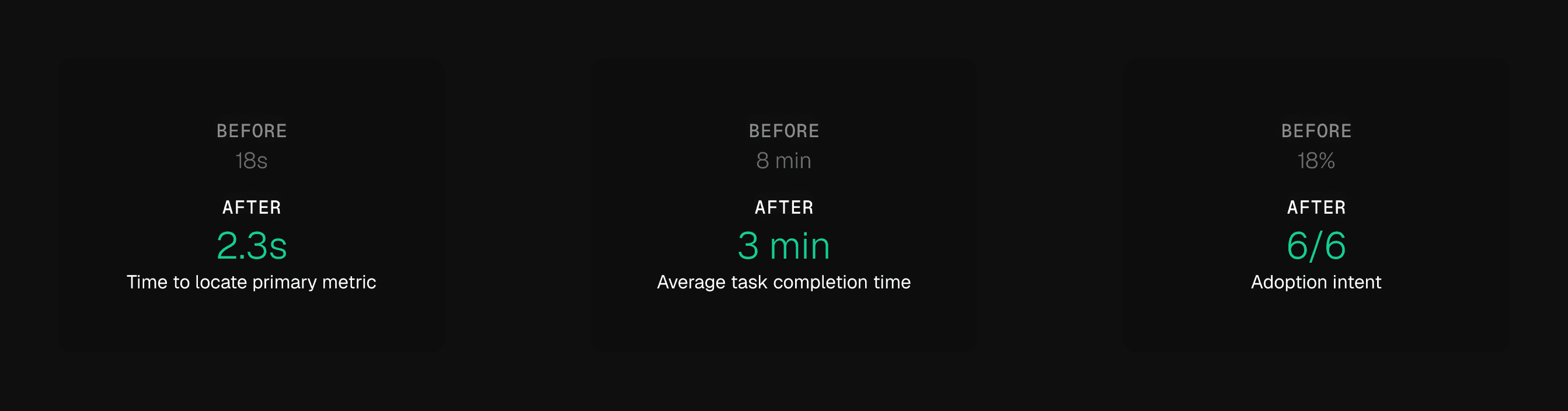
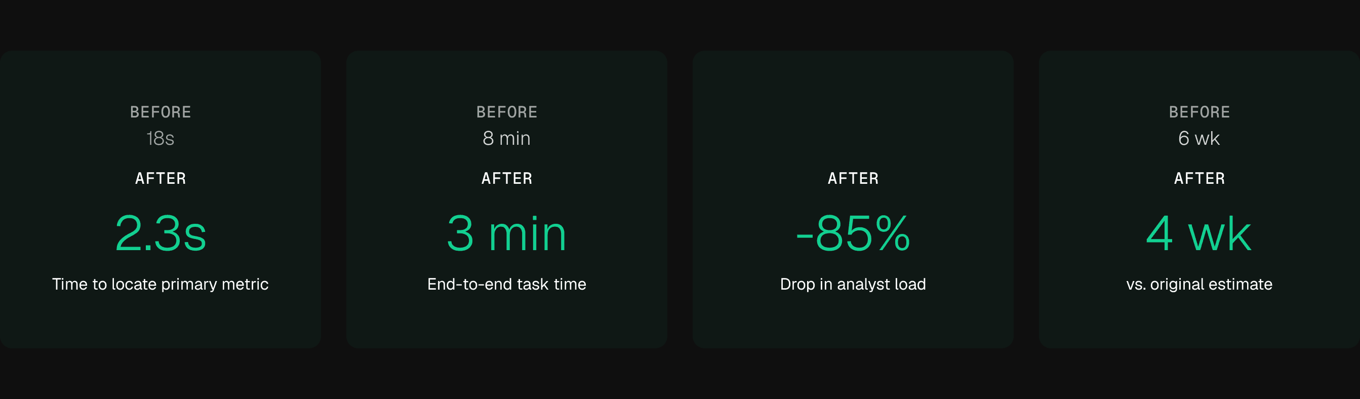
Time to locate a primary metric: 18 seconds before, 2.3 seconds after. Task completion time: 8 minutes before, 3 minutes after. All six participants said they'd stop using their personal spreadsheets.
Six is a small sample. Stated preference in a moderated session isn't real behaviour change. What it gave us was directional confidence to ship and measure against actuals. Which is what we did.

Screen / Prototype High-fidelity Figma prototype — 6 moderated sessions, finance and operations
Design System
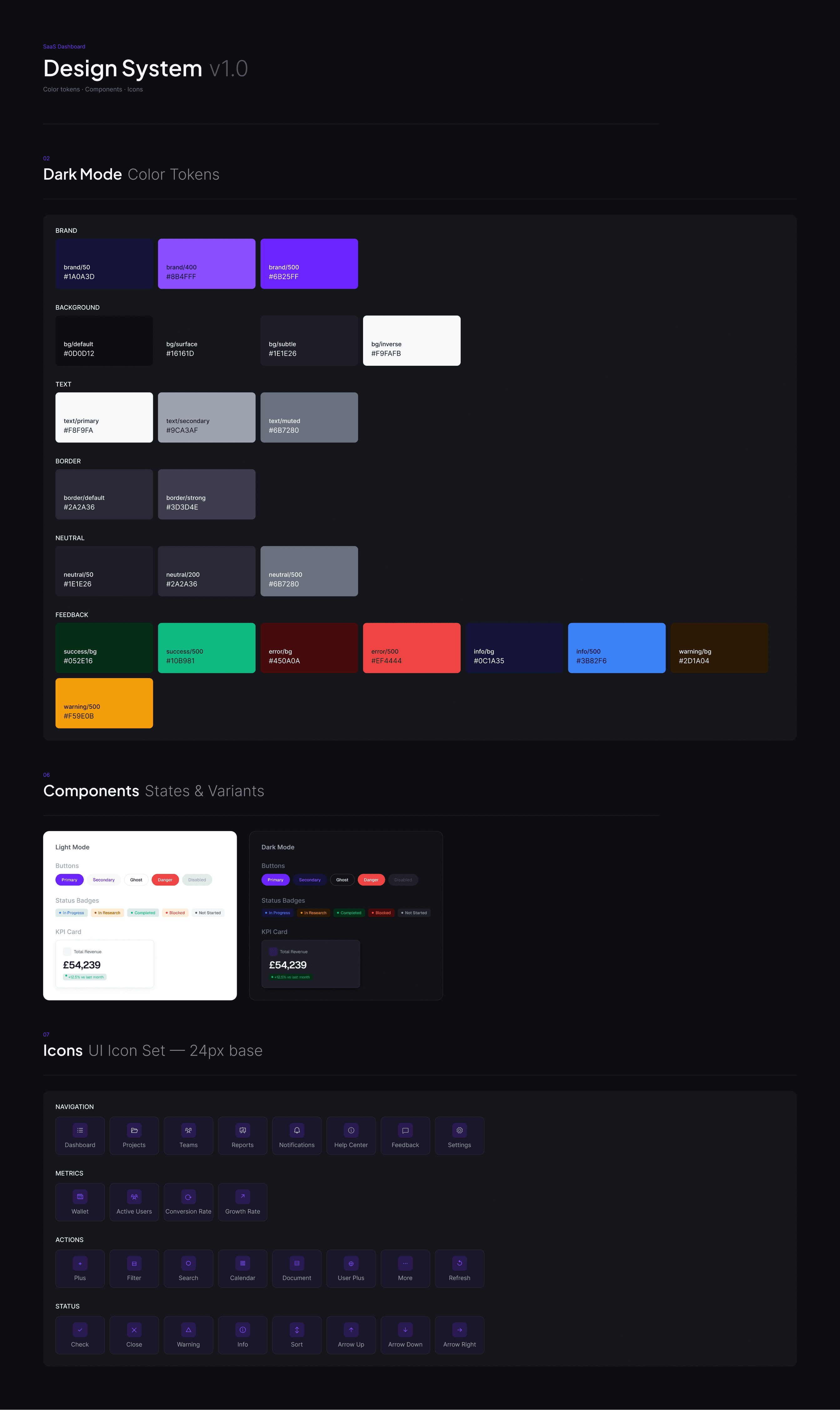
The component library was the other problem. Colour meanings were inconsistent. Four separate card components were doing overlapping jobs.
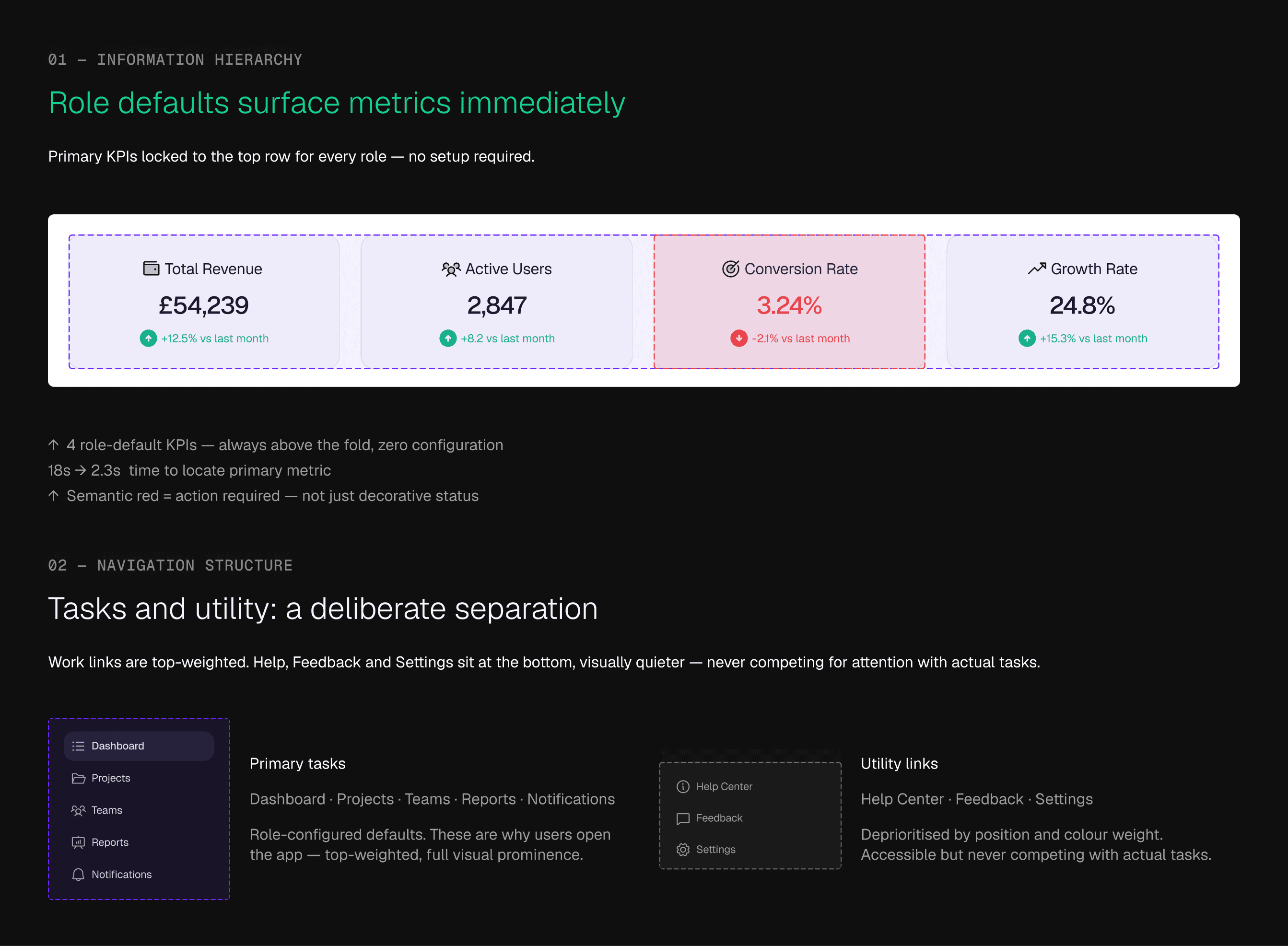
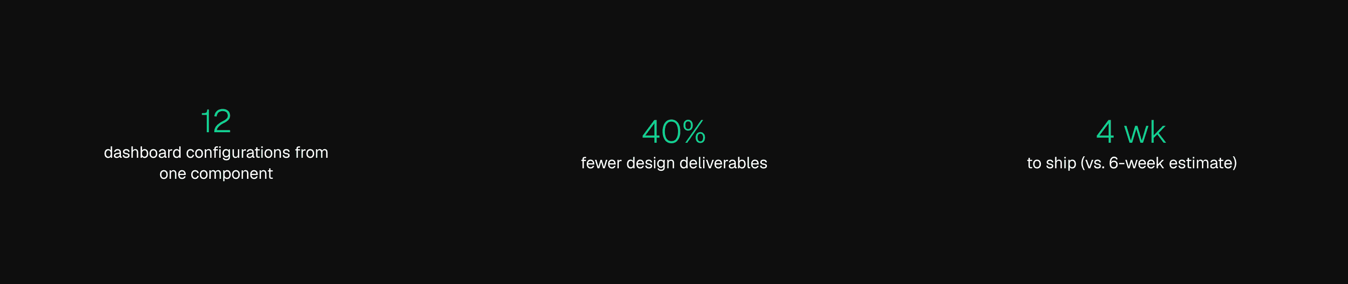
I consolidated them into one data card primitive with four conditional configurations — simple metric, with trend, with context, full drill-down — and applied semantic colour rules across the board. Twelve distinct dashboard layouts. One component. No code changes per layout. Designers stopped making conflicting decisions; users stopped relearning the interface on every screen.
Responsive
My assumption going in: mobile users need a simplified desktop layout. Wrong.
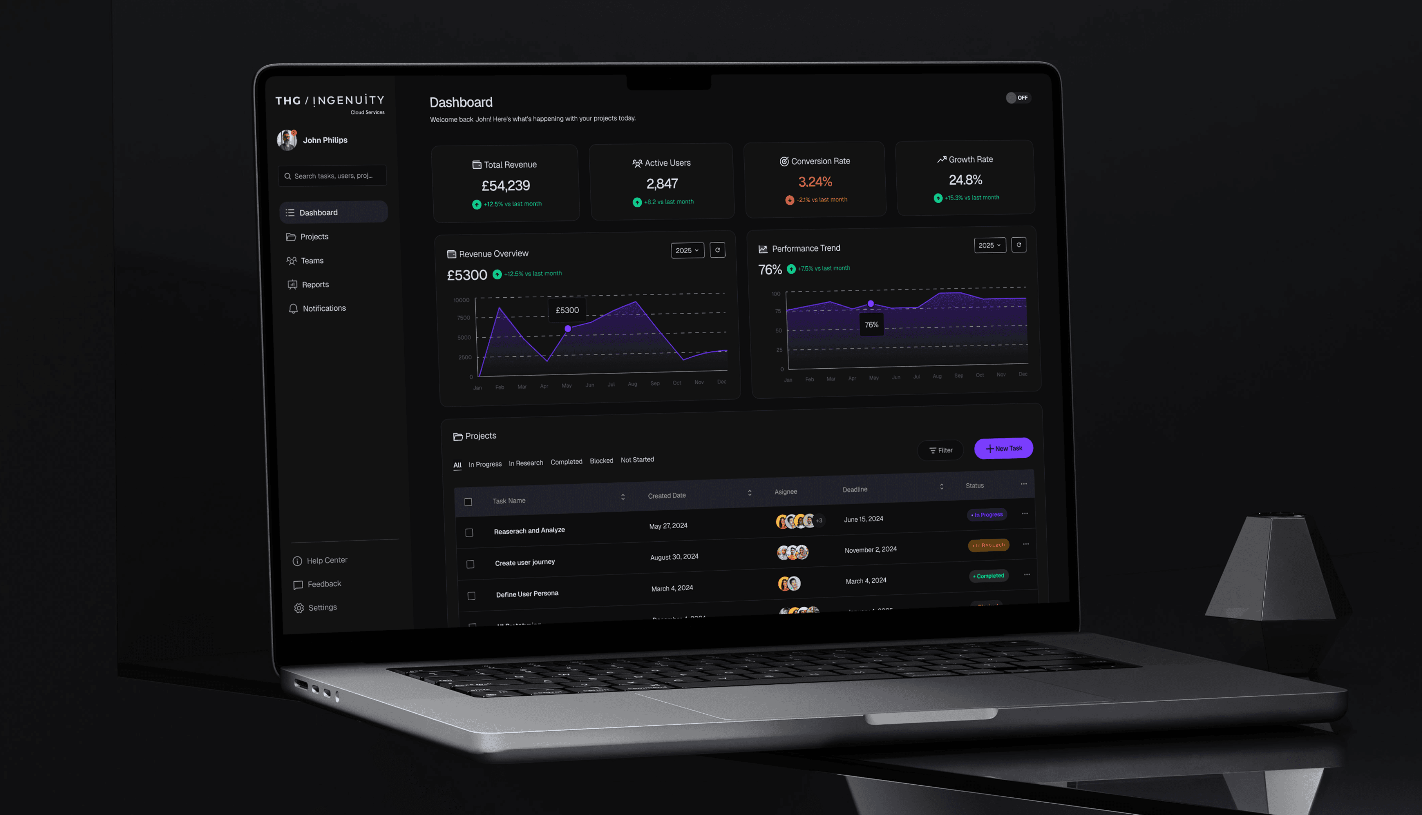
Mobile and desktop users have different intents entirely. Desktop is analysis — drill-down first, KPIs secondary. Mobile is a status check — surface the three numbers that matter, hide everything else. I redesigned the information hierarchy on each breakpoint around intent, not screen size.


What shipped.
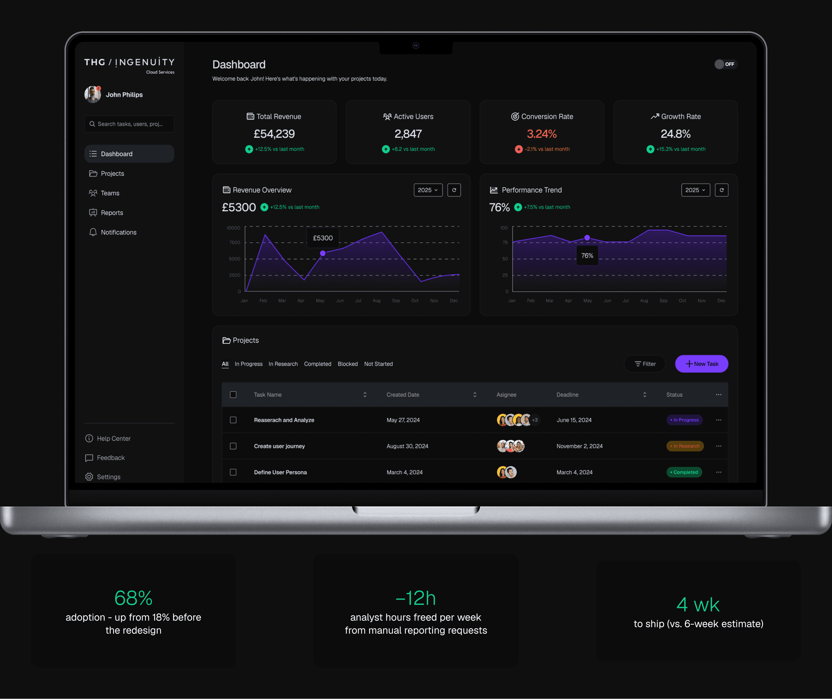
The 85% support ticket drop was the number that mattered most to the business. The 18% adoption stat had been a leadership talking point; the analyst bottleneck was costing real hours every week. The dashboard had been making it worse. Now it was removing it.
What Went Wrong
I assumed heavy dashboard users would prefer dark mode. Post-launch data said otherwise — light mode won, including among the users I expected to go dark.
The reason was environmental: bright offices, natural light, dark mode creating visual friction in their actual workspace. Layout decisions got thorough testing. Environment didn't. I've added environmental context to every research protocol since.
Constraints
Six moderated sessions over two weeks on high-fidelity prototypes. One PM, one frontend team, four-week delivery window. Sample size was a deliberate call — directional signal fast enough to matter, with post-launch data as real validation.
Outcomes
Post-launch adoption wasn't tracked rigorously enough to report cleanly. The performance data suggests real behavioural change. The headline number — whether users actually ditched the spreadsheets — I can't fully close.
Reflection
Small samples find patterns. They don't stress-test edge cases or surface environmental factors. I'd push for a wider pilot before full rollout — not to slow down shipping, but to catch what controlled sessions miss.
More importantly: I'd instrument adoption tracking from day one. The most important metric in this project is the one I can't answer. That's a measurement failure I own.
Smooth Scroll
This will hide itself!
This will hide itself!
THG Dashboard
OVERVIEW
When 82% of users prefer their own spreadsheets over the product, the interface is the problem. The THG Dashboard redesign replaced a generic layout with role-based defaults — putting the right metrics in front of the right people immediately. Discovery time dropped from 18 seconds to 2.3, and support tickets fell 85%.
YEAR
2024
ROLE
Product Design
SERVICES
Product Strategy
UX Research
Dashboard Design
Data Visualization
Design Systems
About the project
THE PROBLEM
A tool nobody trusted.
82% of users ignored the reporting platform and ran their own spreadsheets instead. Not out of habit — the tool genuinely didn't work for them. Critical metrics required two screens minimum to find, and a single generic layout served nobody's actual workflow. Analysts became a manual bottleneck. The dashboard existed; it just wasn't used.
THE DECISION THAT MATTERED
The PM wanted fully customisable layouts. I didn't think that would work.
Every user we tested with a blank canvas and 40+ metric options stalled before making a single choice. Flexibility without structure isn't empowering — it's paralysing. I proposed role-based defaults with constrained customisation instead: opinionated starting layouts per role, widget reordering, and one custom view as an escape valve for edge cases.
The PM agreed. The side effect: fewer layout variations meant a simpler component system and a build estimate that dropped from six weeks to four.
THE ARGUMENT I HAD TO MAKE
A position, not a compromise.
I pushed for role-based layouts before I had shipped data to prove it. The case was built on six moderated sessions — a small sample, but consistent enough to be directional.
The pattern across every session: users with opinionated defaults found their primary metric faster, completed tasks more confidently, and expressed less frustration. Users given a blank canvas spent more time configuring than using.
This wasn't about restricting flexibility. It was about the difference between what users say they want (control) and what actually serves them (a strong starting point). Structured defaults get people to value faster. That's the product argument — and ultimately, the PM moved on it.
What the testing showed.
Six moderated sessions with finance leads and operations heads. High-fidelity Figma prototypes. Two weeks. Six is a small sample — these were directional signals, not statistical proof. What mattered was the consistency of the pattern.
Time to locate a primary metric: 18 seconds before, 2.3 seconds after. Task completion time: 8 minutes before, 3 minutes after. All six participants said they'd stop using their personal spreadsheets.
Six is a small sample. Stated preference in a moderated session isn't real behaviour change. What it gave us was directional confidence to ship and measure against actuals. Which is what we did.
Screen / Prototype High-fidelity Figma prototype — 6 moderated sessions, finance and operations
Design System
The component library was the other problem. Colour meanings were inconsistent. Four separate card components were doing overlapping jobs.
I consolidated them into one data card primitive with four conditional configurations — simple metric, with trend, with context, full drill-down — and applied semantic colour rules across the board. Twelve distinct dashboard layouts. One component. No code changes per layout. Designers stopped making conflicting decisions; users stopped relearning the interface on every screen.
Responsive
My assumption going in: mobile users need a simplified desktop layout. Wrong.
Mobile and desktop users have different intents entirely. Desktop is analysis — drill-down first, KPIs secondary. Mobile is a status check — surface the three numbers that matter, hide everything else. I redesigned the information hierarchy on each breakpoint around intent, not screen size.
What shipped.
The 85% support ticket drop was the number that mattered most to the business. The 18% adoption stat had been a leadership talking point; the analyst bottleneck was costing real hours every week. The dashboard had been making it worse. Now it was removing it.
What Went Wrong
I assumed heavy dashboard users would prefer dark mode. Post-launch data said otherwise — light mode won, including among the users I expected to go dark.
The reason was environmental: bright offices, natural light, dark mode creating visual friction in their actual workspace. Layout decisions got thorough testing. Environment didn't. I've added environmental context to every research protocol since.
Constraints
Six moderated sessions over two weeks on high-fidelity prototypes. One PM, one frontend team, four-week delivery window. Sample size was a deliberate call — directional signal fast enough to matter, with post-launch data as real validation.
Outcomes
Post-launch adoption wasn't tracked rigorously enough to report cleanly. The performance data suggests real behavioural change. The headline number — whether users actually ditched the spreadsheets — I can't fully close.
Reflection
Small samples find patterns. They don't stress-test edge cases or surface environmental factors. I'd push for a wider pilot before full rollout — not to slow down shipping, but to catch what controlled sessions miss.
More importantly: I'd instrument adoption tracking from day one. The most important metric in this project is the one I can't answer. That's a measurement failure I own.
Smooth Scroll
This will hide itself!
This will hide itself!
THG Dashboard
OVERVIEW
When 82% of users prefer their own spreadsheets over the product, the interface is the problem. The THG Dashboard redesign replaced a generic layout with role-based defaults — putting the right metrics in front of the right people immediately. Discovery time dropped from 18 seconds to 2.3, and support tickets fell 85%.
YEAR
2024
ROLE
Product Design
SERVICES
Product Strategy
UX Research
Dashboard Design
Data Visualization
Design Systems
About the project
THE PROBLEM
A tool nobody trusted.
82% of users ignored the reporting platform and ran their own spreadsheets instead. Not out of habit — the tool genuinely didn't work for them. Critical metrics required two screens minimum to find, and a single generic layout served nobody's actual workflow. Analysts became a manual bottleneck. The dashboard existed; it just wasn't used.
THE DECISION THAT MATTERED
The PM wanted fully customisable layouts. I didn't think that would work.
Every user we tested with a blank canvas and 40+ metric options stalled before making a single choice. Flexibility without structure isn't empowering — it's paralysing. I proposed role-based defaults with constrained customisation instead: opinionated starting layouts per role, widget reordering, and one custom view as an escape valve for edge cases.
The PM agreed. The side effect: fewer layout variations meant a simpler component system and a build estimate that dropped from six weeks to four.
THE ARGUMENT I HAD TO MAKE
A position, not a compromise.
I pushed for role-based layouts before I had shipped data to prove it. The case was built on six moderated sessions — a small sample, but consistent enough to be directional.
The pattern across every session: users with opinionated defaults found their primary metric faster, completed tasks more confidently, and expressed less frustration. Users given a blank canvas spent more time configuring than using.
This wasn't about restricting flexibility. It was about the difference between what users say they want (control) and what actually serves them (a strong starting point). Structured defaults get people to value faster. That's the product argument — and ultimately, the PM moved on it.
What the testing showed.
Six moderated sessions with finance leads and operations heads. High-fidelity Figma prototypes. Two weeks. Six is a small sample — these were directional signals, not statistical proof. What mattered was the consistency of the pattern.
Time to locate a primary metric: 18 seconds before, 2.3 seconds after. Task completion time: 8 minutes before, 3 minutes after. All six participants said they'd stop using their personal spreadsheets.
Six is a small sample. Stated preference in a moderated session isn't real behaviour change. What it gave us was directional confidence to ship and measure against actuals. Which is what we did.
Screen / Prototype High-fidelity Figma prototype — 6 moderated sessions, finance and operations
Design System
The component library was the other problem. Colour meanings were inconsistent. Four separate card components were doing overlapping jobs.
I consolidated them into one data card primitive with four conditional configurations — simple metric, with trend, with context, full drill-down — and applied semantic colour rules across the board. Twelve distinct dashboard layouts. One component. No code changes per layout. Designers stopped making conflicting decisions; users stopped relearning the interface on every screen.
Responsive
My assumption going in: mobile users need a simplified desktop layout. Wrong.
Mobile and desktop users have different intents entirely. Desktop is analysis — drill-down first, KPIs secondary. Mobile is a status check — surface the three numbers that matter, hide everything else. I redesigned the information hierarchy on each breakpoint around intent, not screen size.
What shipped.
The 85% support ticket drop was the number that mattered most to the business. The 18% adoption stat had been a leadership talking point; the analyst bottleneck was costing real hours every week. The dashboard had been making it worse. Now it was removing it.
What Went Wrong
I assumed heavy dashboard users would prefer dark mode. Post-launch data said otherwise — light mode won, including among the users I expected to go dark.
The reason was environmental: bright offices, natural light, dark mode creating visual friction in their actual workspace. Layout decisions got thorough testing. Environment didn't. I've added environmental context to every research protocol since.
Constraints
Six moderated sessions over two weeks on high-fidelity prototypes. One PM, one frontend team, four-week delivery window. Sample size was a deliberate call — directional signal fast enough to matter, with post-launch data as real validation.
Outcomes
Post-launch adoption wasn't tracked rigorously enough to report cleanly. The performance data suggests real behavioural change. The headline number — whether users actually ditched the spreadsheets — I can't fully close.
Reflection
Small samples find patterns. They don't stress-test edge cases or surface environmental factors. I'd push for a wider pilot before full rollout — not to slow down shipping, but to catch what controlled sessions miss.
More importantly: I'd instrument adoption tracking from day one. The most important metric in this project is the one I can't answer. That's a measurement failure I own.
Smooth Scroll
This will hide itself!
This will hide itself!