A brand and digital ecosystem built around freediving, depth and control. One identity carried from a mark and a set of rules through to a live website, a social system and physical applications, kept coherent at every stage.
YEAR
2026
ROLE
Brand Identity Designer
UI/UX Designer
Front-End Developer
SERVICES
Brand Identity
UX Strategy
Wireframes
Responsive UI Design
Front-End Development
About the project
Touchdown is a freediving school in Dahab built around structured training, progression and a deep respect for the sport. The school had a name, a training philosophy and a clear point of view, but no visual language to match. The challenge was to build an identity and digital experience that could communicate that philosophy clearly, establish trust with new divers and create a system that could live far beyond a single website. From the first mark to the live site, the project became one connected system.
The Challenge
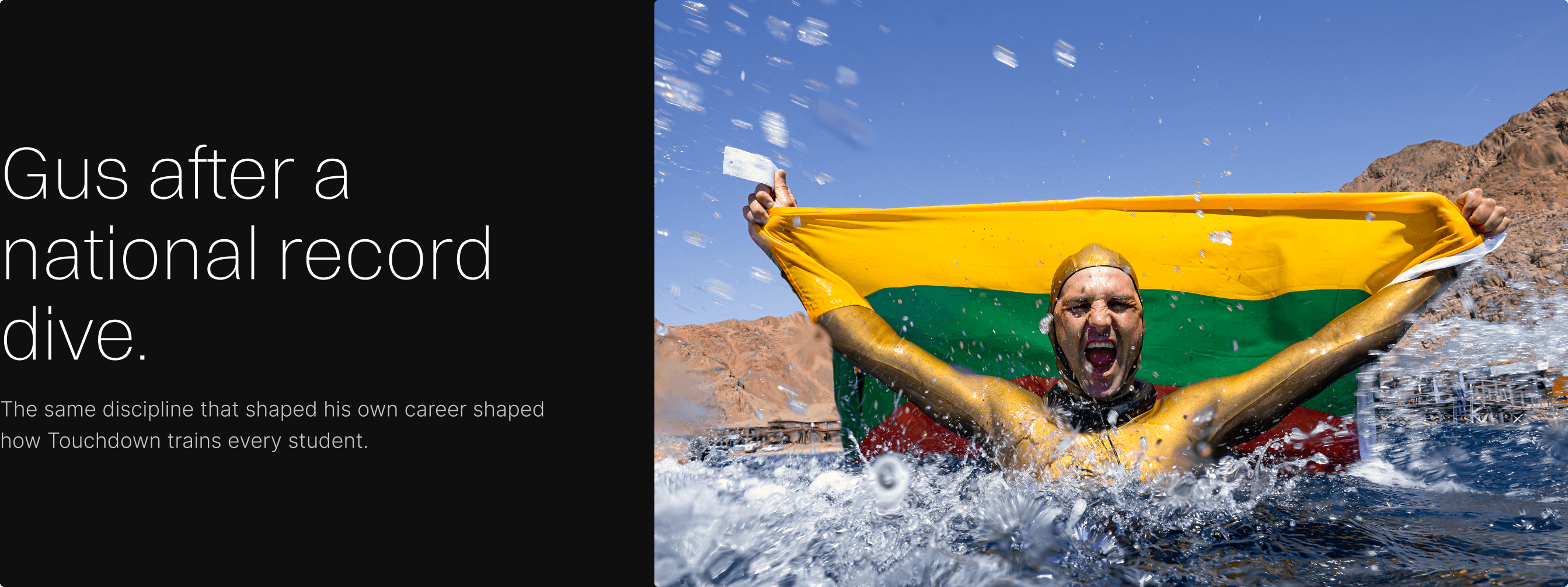
Gus Kreivenas is a world record freediver who built a school around his own training philosophy, based in Dahab's Blue Hole. The brand had to earn credibility with freedivers, a community that can spot a generic dive shop identity immediately, while still welcoming someone who has never held their breath underwater on purpose.
The harder problem sat underneath that. Whatever got designed couldn't just work on a homepage. It had to hold together across a website, a training programme, a social feed and physical materials, without becoming six different projects wearing the same logo.
THE REAL CHALLENGE
Touchdown had a strong training philosophy, but there was no clear system connecting the school, its programmes and the experience of discovering them online.
The challenge was to make the value of the training easier to understand, establish trust with new divers, and create a brand that could grow beyond the website.
This was a small team project: decisions were tested through direct collaboration with Gus and the instructors rather than a formal research phase.
Every decision after this one had to serve a single outcome: turning a curious visitor into a booked diver.
The Direction
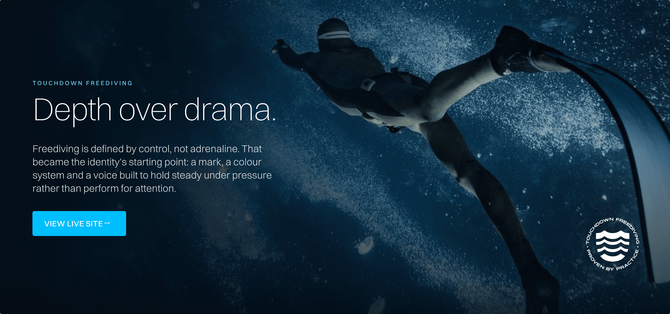
Freediving isn't adrenaline. It's control. Descent, breath, stillness, then a return to the surface. The entire sport runs on precision and calm rather than speed. That became the starting point for the identity.
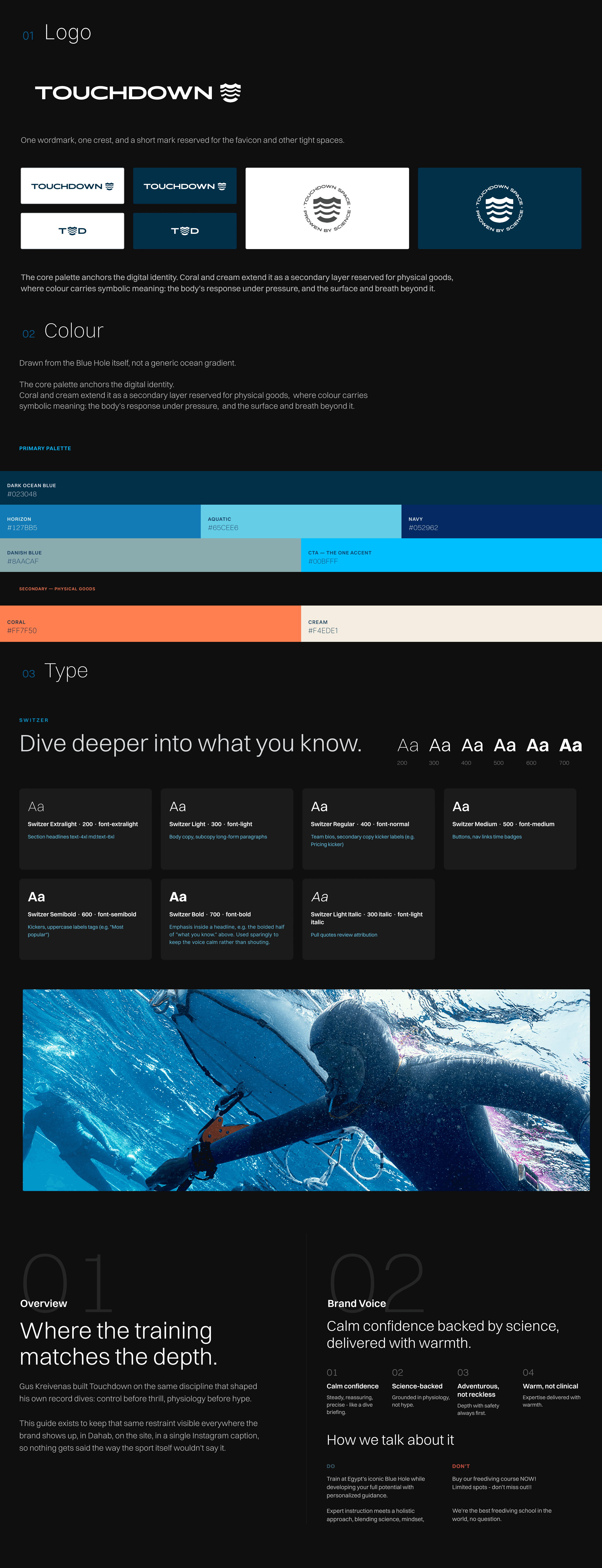
The colour system was drawn from the actual water at the Blue Hole rather than a generic ocean palette, a near black blue at depth, opening into clearer tones near the surface. The graphic language borrows from the physical vocabulary of the sport itself, depth lines, wave forms, the rhythm of a held breath, rather than illustrated fish or bubbles.
BEFORE THE DIRECTION
The first directions treated freediving as a setting: waves, bubbles, gradient blues. They looked like every other dive brand, because they described the water, not the person in it. The shift came once the question changed from what the ocean looks like to what control feels like: depth over drama.

The Brand System
The identity was built around a simple idea: control creates depth.
The visual language needed to feel calm and deliberate rather than energetic or aggressive. The mark became the foundation of the system, supported by a restrained colour palette, strong typography and a graphic language inspired by movement, depth and descent.
A SYSTEM ONLY PROVES ITSELF ONCE IT LEAVES THE GUIDELINES.
Typography provides structure. Colour establishes atmosphere. The mark creates recognition. Graphic elements introduce movement without overwhelming the content.
Together, these elements create a visual language that can evolve while remaining unmistakably Touchdown.
APPLICATIONS
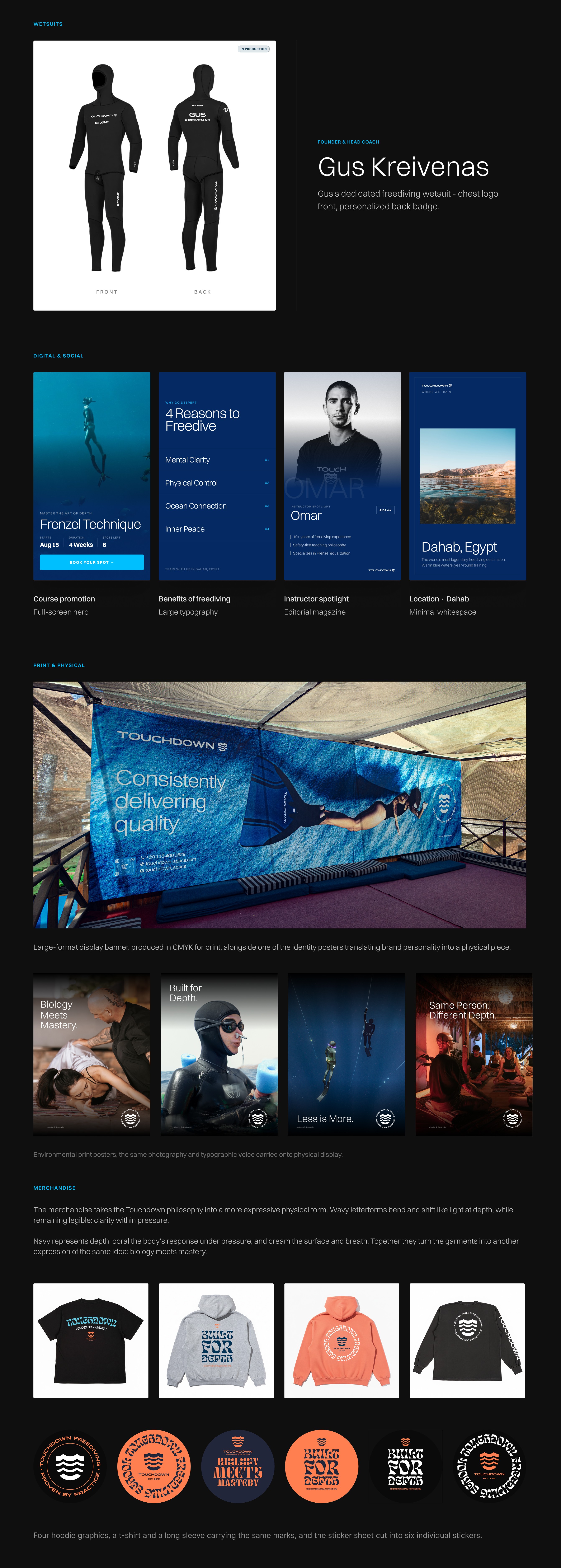
The same wave mark, colour rules and typographic voice had to travel intact across a phone screen, a hoodie, a wetsuit and a printed banner.
The system was designed around consistency rather than repetition. Each application could adapt to its environment while still feeling like part of the same brand.
The identity became less about a collection of assets and more about a set of rules that could be applied anywhere.
DIGITAL & SOCIAL
The social system extends the same visual language into a faster and more flexible format. Strong typography, restrained layouts and consistent use of the identity allow different content to sit within the same world.
PHYSICAL APPLICATIONS
A digital identity still needs to work in the real world. The system was tested across apparel, wetsuits, printed materials and physical environments.
The Website
FROM INTEREST TO UNDERSTANDING.
The website had to do more than look distinctive. It needed to help someone unfamiliar with Touchdown quickly understand what the school offers, where they fit within the training system, and what to do next.
CLARITY BEFORE CONVERSION.
Every page was designed to answer the next question a potential diver would have. What is Touchdown? Who is it for? What programme is right for me? What will I learn? Who will I train with? What happens next?
The experience reduces unnecessary information while keeping the depth needed to make an informed decision.
THE VISUAL SYSTEM BECOMES A WORKING INTERFACE.
Every colour, weight and spacing decision carried into a real, responsive product rather than remaining a static reference sheet.
The brand language was translated into the website across onboarding, pricing, programmes, the team and every page a visitor reaches.
RESPONSIVE DESIGN
The system had to survive outside the desktop canvas. Layouts, typography, spacing and interactions were designed to adapt across screen sizes while maintaining the same visual hierarchy.
Mobile was treated as part of the experience from the beginning rather than as a reduced version of the desktop site.
THE UX DECISION
I structured the experience around the diver's journey rather than the school's internal organisation.
In practice: navigation follows the order a new diver actually needs answers in, not the school's internal categories. Training is explained before pricing is shown, so packages make sense before they're compared. The team appears before the ask to book, so trust is built before commitment.

Collaboration
ART DIRECTION MEETS PHOTOGRAPHY.
I developed the initial image direction and visual style concepts using Midjourney, exploring composition, lighting, underwater perspective and the balance between human presence and environment.
These concepts became a visual reference for the photography, helping establish a consistent image language before production.
I then collaborated closely with Piko to translate that direction into authentic underwater and lifestyle photography for the Touchdown brand. His experience with freediving and underwater photography brought a natural understanding of the environment and helped turn the visual direction into imagery that feels both considered and real.
Photography · Piko
Underwater photography and visual storytelling
View portfolio →
The result
NOT A LOGO. A SYSTEM.
The identity, the website and the physical applications are live, not staged. Touchdown Freediving replaced the school's previous site and now runs on its own domain, built with a CMS behind it so the team can update pricing, team bios and blog content without touching code.
Performance data isn't available yet, the site is newly launched. What's verifiable now is that one system, one mark, one colour language, one voice, carries across the website, the training materials, the merchandise and the print collateral without breaking character anywhere it's been applied.
View the live Touchdown site →
Smooth Scroll
This will hide itself!
This will hide itself!
Touchdown Freediving
OVERVIEW
A brand and digital ecosystem built around freediving, depth and control. One identity carried from a mark and a set of rules through to a live website, a social system and physical applications, kept coherent at every stage.
YEAR
2026
ROLE
Brand Identity Designer
UI/UX Designer
Front-End Developer
SERVICES
Brand Identity
UX Strategy
Wireframes
Responsive UI Design
Front-End Development
About the project
Touchdown is a freediving school in Dahab built around structured training, progression and a deep respect for the sport. The school had a name, a training philosophy and a clear point of view, but no visual language to match. The challenge was to build an identity and digital experience that could communicate that philosophy clearly, establish trust with new divers and create a system that could live far beyond a single website. From the first mark to the live site, the project became one connected system.
The Challenge
Gus Kreivenas is a world record freediver who built a school around his own training philosophy, based in Dahab's Blue Hole. The brand had to earn credibility with freedivers, a community that can spot a generic dive shop identity immediately, while still welcoming someone who has never held their breath underwater on purpose.
The harder problem sat underneath that. Whatever got designed couldn't just work on a homepage. It had to hold together across a website, a training programme, a social feed and physical materials, without becoming six different projects wearing the same logo.
THE REAL CHALLENGE
Touchdown had a strong training philosophy, but there was no clear system connecting the school, its programmes and the experience of discovering them online.
The challenge was to make the value of the training easier to understand, establish trust with new divers, and create a brand that could grow beyond the website.
This was a small team project: decisions were tested through direct collaboration with Gus and the instructors rather than a formal research phase.
Every decision after this one had to serve a single outcome: turning a curious visitor into a booked diver.
The Direction
Freediving isn't adrenaline. It's control. Descent, breath, stillness, then a return to the surface. The entire sport runs on precision and calm rather than speed. That became the starting point for the identity.
The colour system was drawn from the actual water at the Blue Hole rather than a generic ocean palette, a near black blue at depth, opening into clearer tones near the surface. The graphic language borrows from the physical vocabulary of the sport itself, depth lines, wave forms, the rhythm of a held breath, rather than illustrated fish or bubbles.
BEFORE THE DIRECTION
The first directions treated freediving as a setting: waves, bubbles, gradient blues. They looked like every other dive brand, because they described the water, not the person in it. The shift came once the question changed from what the ocean looks like to what control feels like: depth over drama.
The Brand System
The identity was built around a simple idea: control creates depth.
The visual language needed to feel calm and deliberate rather than energetic or aggressive. The mark became the foundation of the system, supported by a restrained colour palette, strong typography and a graphic language inspired by movement, depth and descent.
A SYSTEM ONLY PROVES ITSELF ONCE IT LEAVES THE GUIDELINES.
Typography provides structure. Colour establishes atmosphere. The mark creates recognition. Graphic elements introduce movement without overwhelming the content.
Together, these elements create a visual language that can evolve while remaining unmistakably Touchdown.
APPLICATIONS
The same wave mark, colour rules and typographic voice had to travel intact across a phone screen, a hoodie, a wetsuit and a printed banner.
The system was designed around consistency rather than repetition. Each application could adapt to its environment while still feeling like part of the same brand.
The identity became less about a collection of assets and more about a set of rules that could be applied anywhere.
DIGITAL & SOCIAL
The social system extends the same visual language into a faster and more flexible format. Strong typography, restrained layouts and consistent use of the identity allow different content to sit within the same world.
PHYSICAL APPLICATIONS
A digital identity still needs to work in the real world. The system was tested across apparel, wetsuits, printed materials and physical environments.
The Website
FROM INTEREST TO UNDERSTANDING.
The website had to do more than look distinctive. It needed to help someone unfamiliar with Touchdown quickly understand what the school offers, where they fit within the training system, and what to do next.
CLARITY BEFORE CONVERSION.
Every page was designed to answer the next question a potential diver would have. What is Touchdown? Who is it for? What programme is right for me? What will I learn? Who will I train with? What happens next?
The experience reduces unnecessary information while keeping the depth needed to make an informed decision.
THE VISUAL SYSTEM BECOMES A WORKING INTERFACE.
Every colour, weight and spacing decision carried into a real, responsive product rather than remaining a static reference sheet.
The brand language was translated into the website across onboarding, pricing, programmes, the team and every page a visitor reaches.
RESPONSIVE DESIGN
The system had to survive outside the desktop canvas. Layouts, typography, spacing and interactions were designed to adapt across screen sizes while maintaining the same visual hierarchy.
Mobile was treated as part of the experience from the beginning rather than as a reduced version of the desktop site.
THE UX DECISION
I structured the experience around the diver's journey rather than the school's internal organisation.
In practice: navigation follows the order a new diver actually needs answers in, not the school's internal categories. Training is explained before pricing is shown, so packages make sense before they're compared. The team appears before the ask to book, so trust is built before commitment.
Collaboration
ART DIRECTION MEETS PHOTOGRAPHY.
I developed the initial image direction and visual style concepts using Midjourney, exploring composition, lighting, underwater perspective and the balance between human presence and environment.
These concepts became a visual reference for the photography, helping establish a consistent image language before production.
I then collaborated closely with Piko to translate that direction into authentic underwater and lifestyle photography for the Touchdown brand. His experience with freediving and underwater photography brought a natural understanding of the environment and helped turn the visual direction into imagery that feels both considered and real.
Photography · Piko
Underwater photography and visual storytelling
View portfolio →
The result
NOT A LOGO. A SYSTEM.
The identity, the website and the physical applications are live, not staged. Touchdown Freediving replaced the school's previous site and now runs on its own domain, built with a CMS behind it so the team can update pricing, team bios and blog content without touching code.
Performance data isn't available yet, the site is newly launched. What's verifiable now is that one system, one mark, one colour language, one voice, carries across the website, the training materials, the merchandise and the print collateral without breaking character anywhere it's been applied.
View the live Touchdown site →
Smooth Scroll
This will hide itself!
This will hide itself!
Touchdown Freediving
OVERVIEW
A brand and digital ecosystem built around freediving, depth and control. One identity carried from a mark and a set of rules through to a live website, a social system and physical applications, kept coherent at every stage.
YEAR
2026
ROLE
Brand Identity Designer
UI/UX Designer
Front-End Developer
SERVICES
Brand Identity
UX Strategy
Wireframes
Responsive UI Design
Front-End Development
About the project
Touchdown is a freediving school in Dahab built around structured training, progression and a deep respect for the sport. The school had a name, a training philosophy and a clear point of view, but no visual language to match. The challenge was to build an identity and digital experience that could communicate that philosophy clearly, establish trust with new divers and create a system that could live far beyond a single website. From the first mark to the live site, the project became one connected system.
The Challenge
Gus Kreivenas is a world record freediver who built a school around his own training philosophy, based in Dahab's Blue Hole. The brand had to earn credibility with freedivers, a community that can spot a generic dive shop identity immediately, while still welcoming someone who has never held their breath underwater on purpose.
The harder problem sat underneath that. Whatever got designed couldn't just work on a homepage. It had to hold together across a website, a training programme, a social feed and physical materials, without becoming six different projects wearing the same logo.
THE REAL CHALLENGE
Touchdown had a strong training philosophy, but there was no clear system connecting the school, its programmes and the experience of discovering them online.
The challenge was to make the value of the training easier to understand, establish trust with new divers, and create a brand that could grow beyond the website.
This was a small team project: decisions were tested through direct collaboration with Gus and the instructors rather than a formal research phase.
Every decision after this one had to serve a single outcome: turning a curious visitor into a booked diver.
The Direction
Freediving isn't adrenaline. It's control. Descent, breath, stillness, then a return to the surface. The entire sport runs on precision and calm rather than speed. That became the starting point for the identity.
The colour system was drawn from the actual water at the Blue Hole rather than a generic ocean palette, a near black blue at depth, opening into clearer tones near the surface. The graphic language borrows from the physical vocabulary of the sport itself, depth lines, wave forms, the rhythm of a held breath, rather than illustrated fish or bubbles.
BEFORE THE DIRECTION
The first directions treated freediving as a setting: waves, bubbles, gradient blues. They looked like every other dive brand, because they described the water, not the person in it. The shift came once the question changed from what the ocean looks like to what control feels like: depth over drama.
The Brand System
The identity was built around a simple idea: control creates depth.
The visual language needed to feel calm and deliberate rather than energetic or aggressive. The mark became the foundation of the system, supported by a restrained colour palette, strong typography and a graphic language inspired by movement, depth and descent.
A SYSTEM ONLY PROVES ITSELF ONCE IT LEAVES THE GUIDELINES.
Typography provides structure. Colour establishes atmosphere. The mark creates recognition. Graphic elements introduce movement without overwhelming the content.
Together, these elements create a visual language that can evolve while remaining unmistakably Touchdown.
APPLICATIONS
The same wave mark, colour rules and typographic voice had to travel intact across a phone screen, a hoodie, a wetsuit and a printed banner.
The system was designed around consistency rather than repetition. Each application could adapt to its environment while still feeling like part of the same brand.
The identity became less about a collection of assets and more about a set of rules that could be applied anywhere.
DIGITAL & SOCIAL
The social system extends the same visual language into a faster and more flexible format. Strong typography, restrained layouts and consistent use of the identity allow different content to sit within the same world.
PHYSICAL APPLICATIONS
A digital identity still needs to work in the real world. The system was tested across apparel, wetsuits, printed materials and physical environments.
The Website
FROM INTEREST TO UNDERSTANDING.
The website had to do more than look distinctive. It needed to help someone unfamiliar with Touchdown quickly understand what the school offers, where they fit within the training system, and what to do next.
CLARITY BEFORE CONVERSION.
Every page was designed to answer the next question a potential diver would have. What is Touchdown? Who is it for? What programme is right for me? What will I learn? Who will I train with? What happens next?
The experience reduces unnecessary information while keeping the depth needed to make an informed decision.
THE VISUAL SYSTEM BECOMES A WORKING INTERFACE.
Every colour, weight and spacing decision carried into a real, responsive product rather than remaining a static reference sheet.
The brand language was translated into the website across onboarding, pricing, programmes, the team and every page a visitor reaches.
RESPONSIVE DESIGN
The system had to survive outside the desktop canvas. Layouts, typography, spacing and interactions were designed to adapt across screen sizes while maintaining the same visual hierarchy.
Mobile was treated as part of the experience from the beginning rather than as a reduced version of the desktop site.
THE UX DECISION
I structured the experience around the diver's journey rather than the school's internal organisation.
In practice: navigation follows the order a new diver actually needs answers in, not the school's internal categories. Training is explained before pricing is shown, so packages make sense before they're compared. The team appears before the ask to book, so trust is built before commitment.
Collaboration
ART DIRECTION MEETS PHOTOGRAPHY.
I developed the initial image direction and visual style concepts using Midjourney, exploring composition, lighting, underwater perspective and the balance between human presence and environment.
These concepts became a visual reference for the photography, helping establish a consistent image language before production.
I then collaborated closely with Piko to translate that direction into authentic underwater and lifestyle photography for the Touchdown brand. His experience with freediving and underwater photography brought a natural understanding of the environment and helped turn the visual direction into imagery that feels both considered and real.
Photography · Piko
Underwater photography and visual storytelling
View portfolio →
The result
NOT A LOGO. A SYSTEM.
The identity, the website and the physical applications are live, not staged. Touchdown Freediving replaced the school's previous site and now runs on its own domain, built with a CMS behind it so the team can update pricing, team bios and blog content without touching code.
Performance data isn't available yet, the site is newly launched. What's verifiable now is that one system, one mark, one colour language, one voice, carries across the website, the training materials, the merchandise and the print collateral without breaking character anywhere it's been applied.
View the live Touchdown site →
Smooth Scroll
This will hide itself!
This will hide itself!